I forget precisely where I picked up this habit, but ever couple of years I like to stump my fellow video game scholars over at Mobygames in a curious but creative way, collaging up a logo using letters sourced, ransom-note-style, from the distinctive box art of celebrated video and computer games. Eventually I began CCing these challenges to
the old blog, and even
to this new blog. But the fact remains I haven't done one for quite a while. Well, I guess I've got momentum; I put one together... and went on to scrape together another one! The first took the experts about a week to solve: you can warm up on it before we switch to "expert mode" and I defy you to fill in the blanks yourself:
Now are you ready to have revealed the sources of these letters? Spoiler warning: here they come! The leading M comes from none other than MegaMan 4. (Where possible, I like to source a letter from the beginning of a word. Sometimes that's not always the interesting letter in that word, but it's a bone I toss to the puzzle-solvers: looking for an M, what's an M-game? A game starting with an M (especially alliteratively, as here) will naturally be where their mind wanders first.)
As just mentioned above, here's an exception to prove the rule: "No More Heroes" contains three "O"s, all more interesting than the other letters in the words. I guess it's more like a guideline.
This "B" caused a lot of problems for a lot of people. I didn't think of Marble Madness as a forgotten game, and I figured that the NES version would be one of the most-seen... but its logo was burdened by being part of a wave of logos that reeeeally wanted to remind people of Indiana Jones for some reason (think that's bad, A Boy And His Blob does it with the logo AND the theme song!) and folks were just finding every game using this font except for the one I actually used.
So down the line I actually updated the collaged logo with this more distinctive B sourced from a different platform's release of the same game. Early EA game boxes: so classy!
Not every letter needs to be a mystery to unravel; sometimes I toss people a bone and just give them an easy win. Hence this "Y", from Destiny 2:
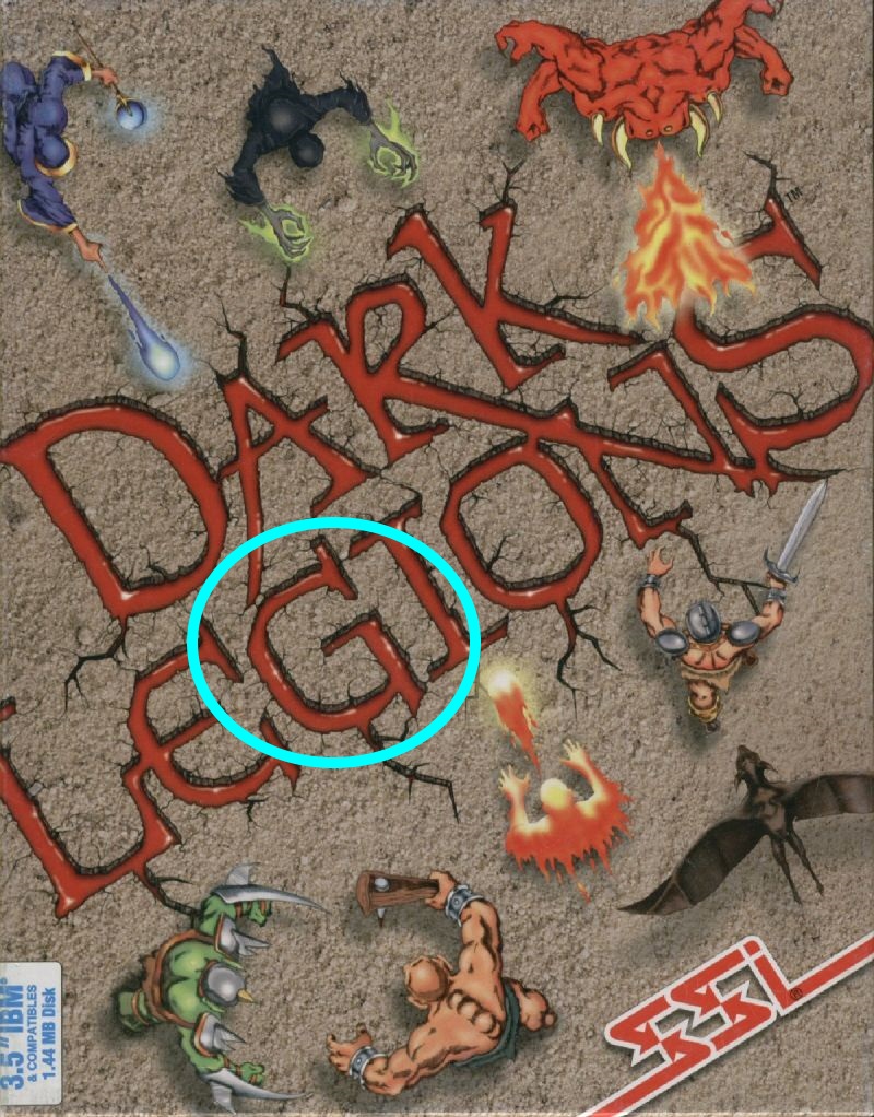
New line! This G served to be quite a bit trickier than I'd anticipated -- I gather that SSI may have figured more prominently in my particular circles than in the wider world. But it's nonetheless quite distinctive, from "Dark Legions":
Electronic cover art doesn't give you as much to work with, but (as with Destiny above) I like to work with modern classics as well as the genuinely vintage ones, so the "A" came from "Don't Starve":
The second "M" was a bit of a postmodern mis-en-abyme self-indulence: for my ransom-note-style collage I have sampled game box art with a ransom-note typographical conceit, for a game with "ransom" in its name. River City Ransom of course:
I thought that this one would be easier, but its American marketing and packaging always was quite at odds from the game content, so there may remain some lingering cognitive dissonance. The messy "E" originates from "Zombie Nation":
And to help keep things interesting, I flipped this letter so as to better fit -- a second SSI game quoted, this "S" comes from A Line In The Sand:
(and I like to include tastes of extraordinary video game experiences in the background: in this case, it's the boss screen from F.Godmom, shareware puzzle game famously beloved of Tom "Ion Storm" Hall!)
OK, now "MobyGames" is easy, it only contains nine letters. You can try your hand at "Pixel Pompeii", with 25% further challenge!


No comments:
Post a Comment