I forget precisely where I picked up this habit, but ever couple of years I like to stump my fellow video game scholars over at Mobygames in a curious but creative way, collaging up a logo using letters sourced, ransom-note-style, from the distinctive box art of celebrated video and computer games. Eventually I began CCing these challenges to the old blog, and even to this new blog. But the fact remains I haven't done one for quite a while. Well, I guess I've got momentum; I put one together... and went on to scrape together another one! The first took the experts about a week to solve: you can warm up on it before we switch to "expert mode" and I defy you to fill in the blanks yourself:
Now are you ready to have revealed the sources of these letters? Spoiler warning: here they come! The leading M comes from none other than MegaMan 4. (Where possible, I like to source a letter from the beginning of a word. Sometimes that's not always the interesting letter in that word, but it's a bone I toss to the puzzle-solvers: looking for an M, what's an M-game? A game starting with an M (especially alliteratively, as here) will naturally be where their mind wanders first.)
As just mentioned above, here's an exception to prove the rule: "No More Heroes" contains three "O"s, all more interesting than the other letters in the words. I guess it's more like a guideline.
This "B" caused a lot of problems for a lot of people. I didn't think of Marble Madness as a forgotten game, and I figured that the NES version would be one of the most-seen... but its logo was burdened by being part of a wave of logos that reeeeally wanted to remind people of Indiana Jones for some reason (think that's bad, A Boy And His Blob does it with the logo AND the theme song!) and folks were just finding every game using this font except for the one I actually used.
So down the line I actually updated the collaged logo with this more distinctive B sourced from a different platform's release of the same game. Early EA game boxes: so classy!
Not every letter needs to be a mystery to unravel; sometimes I toss people a bone and just give them an easy win. Hence this "Y", from Destiny 2:
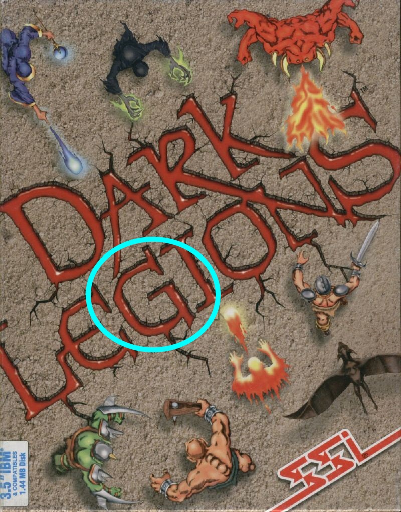
New line! This G served to be quite a bit trickier than I'd anticipated -- I gather that SSI may have figured more prominently in my particular circles than in the wider world. But it's nonetheless quite distinctive, from "Dark Legions":
Electronic cover art doesn't give you as much to work with, but (as with Destiny above) I like to work with modern classics as well as the genuinely vintage ones, so the "A" came from "Don't Starve":
The second "M" was a bit of a postmodern mis-en-abyme self-indulence: for my ransom-note-style collage I have sampled game box art with a ransom-note typographical conceit, for a game with "ransom" in its name. River City Ransom of course:
I thought that this one would be easier, but its American marketing and packaging always was quite at odds from the game content, so there may remain some lingering cognitive dissonance. The messy "E" originates from "Zombie Nation":
And to help keep things interesting, I flipped this letter so as to better fit -- a second SSI game quoted, this "S" comes from A Line In The Sand:
(and I like to include tastes of extraordinary video game experiences in the background: in this case, it's the boss screen from F.Godmom, shareware puzzle game famously beloved of Tom "Ion Storm" Hall!)
OK, now "MobyGames" is easy, it only contains nine letters. You can try your hand at "Pixel Pompeii", with 25% further challenge!
OK, first things first: let's queue up the tunes. Here's a .SID arrangement of the song "A Kind Of Magic", made in 2 days by Martin Galway for the Ocean Software Commodore 64 video game adaptation of the 1986 movie Highlander (and by all reports, the best part of it.)
Got the song rolling? Good. Here we go: there's no good explanation for it. My specific demographic cohort got involved with the artscene roughly contemporary to the culmination of the enterprise that was the band Queen. There it was, we were in early high school, 1992, Wayne's World was in the theatres (making Bohemian Rhapsody the only song to ever be the UK Christmas #1 song in two different years, '75 and '91), and everyone who was anyone performed at the '92 Freddie Mercury memorial concert at Wembley Stadium (did you see the look on Axl Rose's face after Elton John hugged him?)
It was all a bit of a curiosity to me, but to my classmate and colleague Nitnatsnoc (nickname sourced from an Immersion Francais Sciences Humaines unscramble-the-word exercise about the late Roman Empire) the Queen seed that the context planted took root and grew like a flourishing weed. He had caught the bug, and between dreams and schemes to set up our own BBS, he kept trying to share what he felt were the most fascinating nuggets of dank Queen lore. "Did you know that after Freddie Mercury died, he was castrated?" "... ?!" "Sorry, did I say castrated? I meant cremated!" Even once we got our BBS together, the first Mistigris WHQ (world headquarters) The Screaming Tomato, he would hold forth on all matters Queen (such as they were -- as he noted many a time, there are only so many breaking developments in your favorite band once their lead singer dies) in the message bases and at meets and even allude to it in the headers of his ANSI art illustrations (here's an example from MIST1094, where he mentions Queen in all his scrollers save one. The following month, he reports: "Remember? I was that guy who never stopped talking about Queen in his ANSI headers." You might think he'd have gotten over it by 0195, but think again. March? Nope! He doesn't mention them in the Mistigris April 1995 collection, an artpack which he was in charge of assembling, but look a little closer: the "file separators" are all Queen song lyrics!)
So even though the band formed in 1970 and made its most audacious leaps forward before we were ever born, due to my close association with this freshly minted Queen mega-fan, memories of the early '90s still resonate in a very Queen-ly way. Turns out, some other computer artists and textmode specialists feel the same way! Here's as complete a gallery as I've been able to lazily come up with. I'll try to go in a meandering chronological-by-subject sequence.
For a bonus, some 20 years closer to the source, the same image appeared in a still from the 1987 C64 demo "Queen Alive" by the Norfolk Cracking Service (and, who knows, there might be further such goodies to be found within should anyone care to actually run the demo in question):
Here we have a contest-winning Fat Bottomed Girls / Bicycle Race (1978) piece by teletext genius Horsenburger from the early 2017 Block Party convention:
This is a monochrome piece by Russian ANSI artist dman_pcb depicting Queen frontman Freddie Mercury in his "yellow leather jacket" period circa 1986-89. No colours, but it still gets the idea across:
That yellow leather jacket is alluded to here again, followed by a distinctly Nitnatsnoc-ian (it was inevitable, really) toony ANSI art interpretation of the Queen crest:
CCCfire of Mistigris also drew the crest in ANSI art, beneath Mick Rock's distinctive group shot used in the album cover of Queen II (1974) as well as closing (and opening, Nitty points out!) the Bohemian Rhapsody music video:
Horsenburger took a crack at reproducing that group shot in teletext also:
The artist is sadly unknown, alas (MZ-700 is the machine), but the same scene again was attempted (quite successfully, in my estimation, given the limits of the format) in the SHARPSCII character art medium:
and, OK, this is no textmode art at all -- pixelart but still very a propos, one final no-one-can-get-more-minimalist-than-this take on the same scene:
While we're on the Bohemian Rhapsody wavelength, we interrupt this gallery of visual art for some further (non-underground) chipmusic adaptations of Queen songs. Here they are, the notorious abysmal fragmentary arrangements of "Bohemian Rhapsody" from the SNES and Sega Genesis versions of the 1993 Wayne's World movie video game tie-in -- fanboys claim that the Genesis version is worse, but it's an academic distinction. (The Genesis version, conversely, implements the headbanging quite a bit better!) The separate Game Boy WW version somehow manages to have a superior arrangement of Bohemian Rhapsody, picking up where the others leave off. (Ironically, a member of my band once contacted me late at night, letting me know that she was stuck at a party sitting next to a man whose chiefest claim to fame was apparently having composed the music for the Game Boy version of Wayne's World, and did I have any questions for him? It was put together by local developers, so the claim checks out -- she must have been seated next to one Paul Wilkinson. Little did I realise I'd someday be dedicating a paragraph in a blog post to that very subject or I might have passed along some follow-up questions. Alas!)
(Of course, even the least of these is still realms beyond the execrable recording of Bohemian Rhapsody made an a basement TABmeet and later released in an April Fool's artpack.)
Settled your stomach yet? This striking teletext screen depicts the album art to 1989's The Miracle, originally computer art itself -- composited using Quantel Paintbox -- as drawn by Horsenburger:
And closing down our hit parade chronologically, teletext organizer Illarterate drew this screen in honour of what would have been Freddie Mercury's 70th birthday in September of 2017:
And that's it for the visual art, but here's one more tune, an uncredited arrangement of 1980's "Crazy Little Thing Called Love, from the opening and closing (credits) to the 1983 Commodore 64 game "Frantic Freddie" (no relation):
BUT WAIT! The Queenmeister himself, Nitnatsnoc, has emerged from retirement to make a couple of further notes:
Speaking of music videos, not sure if you know, but the video for The Invisible Man (by Queen) has a video game theme [ed. looks a lot like Activision's 1985 Little Computer People], and starts with a shot of a shelf full of real C64 titles. Also, there was a Queen video game in the 90s called The eYe which had several instrumental and remixed versions of Queen songs, although by then you couldn't call it "computer game music."
(Jan, 2018: "Mister Girls", trying somehow to poke fun at my computer art collective, release a very strange artpack including the following piece, an ANSI art adaptation of Queen's 1982 album Hot Space:)
Supplemental: oh wait, that must have been in response to Uglifruit's teletext screen on the same subject from the MIST0917 artpack:
And while I'm in here making an update, here's one final specimen, a PETSCII rendition of Freddie Mercury drawn by Jate of HiRMU:


#/media/File:Queen_News_Of_The_World.png)
#/media/File:Queen_The_Miracle.png)