True to form, no sooner to I get a foot-dragging not-ANSI-art post out the door then another ANSI feature tries to shoulder its way through before the thing even has a chance to close again. Has it really been six months? The sad part is that this isn't even diminishing my stockpile of video game textmode art -- these are just additions to it (barring this introductory image -- the splash screen for Elite for Emacs, no joke) I extracted from the giant textfiles.com PD ANSI art midden (and a few contemporary finds from the earliest underground ANSI artpacks.) The stockpile remains looming massive on the horizon. I look forward to discharging at least one installment per month from this point onward or I will grow old and die before getting through them all.
So. It's the late '80s / early '90s. What are people playing games on?
That's right, here in North America, they're fogging up their brain on their Nintendo Entertainment Systems (nice work, BP!), playing games such as Zelda 2: The Adventure of Link (hats off, Michael!) ...
Metroid... (Samus by Posyden of iCE -- using high ASCII characters in place of latin letters in your handle was cool for about one week in 1993)
Mike Tyson's Punch-Out (Soda Popinski by Flying Frenchman -- a kingly handle if ever there was one -- of SDA (??) and DEVO -- which was a local 604-based courier group! Fair enough -- Bone Crusher was a renowned 604 warez board SysOp, and the number listed is in the 604!)
and Final Fantasy 3 (Mog the Moogle by Hung T. Nguyen... this is, incidentally, a very strange way to be looking at TheDraw. He must have had a 50-column session open on a Windows '95 system. The characters look different -- certainly the letters do, too bad no shading blocks are used here! -- but it's undeniably ANSI, and it's confirmed legit right down to its date of creation 8)
Other home gamers might have run other games on other machines -- for instance, if they had a PC Engine (sorry, TurboGrafx-16) they might have been playing Bonk's Adventures (this likeness by Pyro of GRiM -- that must be an easter egg, I don't remember that particular altered state being part of my gameplay experience) ...
... or its retrofuturistic spin-off, Air Zonk. (TSP of iCE cranked out this almost overly-compact likeness.)
Did I mention Air Zonk? (Posyden strikes again -- this rendition is quite a bit looser, as though every one of his facial features was just floating near the others without any of them being connected.)
My memory and all existing records must fail me here, because apparently the kids simply couldn't get enough of their Air Zonk! (Darkman of ACiD delivers.)
But OK, enough with the console games. We weren't calling up BBSes from our consoles! When our big brothers wouldn't share the joysticks, we went over to the computer room and played computer games! Here's a lovely "Ultima" font by Groo of SDA, celebrating episode 7 of this wonderful game the colleagues of the artist have just helped you to steal from its creators without paying them:
And this is a new one, perhaps the first time in history that someone drew a piece of ANSI art in celebration of an Infocom text adventure. Why? Because while they could be represented in a textmode screen, what you would see there, nineteen times out of 20, was ... pure text. Beyond Zork was no exception -- sure, some platforms' releases featured a splash screen celebrating (as here) the cover artwork on the game's box. We won't come across anything else like this, probably ever!
Hey, don't you know it's rude to point? Anyone who has ever played Space Quest 4 (sorry, Space Quest XII: Vohaul's Revenge II) will remember this sorry cyborg shambling around the ruins of Xenon prepared to ruin the player's day, ANSIfied by Dr. X of Hype. (Don't worry, there are also ANSIs out there of the Energizer Bunny, everyone is treated fairly here.)
And ending on a real high note, here's a rendition of Blizzard's first taste of fantasy, The Three Vikings, by Elminster of Legacy. Next time we return to Video Game Textmode Art Theatre, most likely we'll be looking at considerably more recent works. See you then!
Blogging music is hard! With a visual art topic, you can just park your eyes in front of it for a minute and write about what you see and what it makes you think of. Whatever you write, the reader can immediately confirm for themselves! If you write about a song, however, any reference to a payoff at the end demands the viewer listen to the song all the way through just to see if they agree with you. In short, it's slower. So while I've known that I wanted to blog up this old song just about since beginning this blog a year and a half ago, I've prioritized it beneath more instant appeals such as a seemingly endless litany of ANSI art. It only surfaces now since I've voluntarily adopted a policy of alternating ANSI posts with entries on other topics, and of course since Pitchfork has just published its piece on SIMPSONWAVE it will never again be timelier than it is at this moment. (If I was thinking clearly I'd have bundled this up in last week's discussion of BARTBLND.)
So on April Fool's Day, 1993, Fox aired So It's Come to This: A Simpsons Clip Show (9F17) in their 4th season. In addition to numerous other gags, it included a montage sequence compiling a wide and varied selection of Homer Simpson's "D'oh" exclamations from the second and third season -- no fewer than 32 of them. At this liminal moment on the technological frontier, some genius digitized the audio track of the sequence, and it merrily circulated in a most postmodern fashion, bereft of any context or, indeed, meaning. For kicks, I assigned it as my family's Windows 3.11 shutdown sound -- slowing down the process considerably -- and for my troubles, I found the computer bedecked with a Printshop tractor feed dot matrix printer banner proclaiming my computer access temporarily revoked due to pranksterism.
Sami "PrOtoCol" Tammilehto of ACiD spent a little longer considering what was to be done before coming up with quite a more compelling application for these annoyed grunts. It was a painfully true cliche that audio samples from movies and TV were the tail that wagged the dog of lousy tracker music, like the medieval practice of masking the flavour of rotting food with inappropriate superdoses of strong spices, but their gratuitous overuse didn't necessarily apply 100% of the time... you can consider this track the virtuous 1 percent that broke through the cliche. The striking composition travels through several movements in a well-considered fashion, and would be compelling even in the absence of its raison d'etre (though that might make its closing drum roll somewhat perplexing.) The highest praise I can extend it is that it survives a detour through a tropical steel-drum mini-arrangement of Bobby McFerrin's 1988 mega-hit Don't Worry Be Happy. Because PrOtoCol was a fellow member (represent!) of ACiD (I, uh, should assume that everyone will appreciate the significance there: first major group of the PC underground artscene, first major ANSI art group, remained to a certain extent pre-eminent over everything that followed until the scene as a whole largely dried up by the end of the century) he also figured out a way to use silent samples to provide an animated textmode signature appear in the song's introduction when played in a music tracker program. Truly every aspect of this creation is polished precisely as far as it can be without running the risk of feeling baroque or ostentatious. I dare say people will still be enjoying the D'oh Boys Choir after they have long since forgotten SIMPSONWAVE. So now, without further ado, I present... the song!
And its sample messages:
---------------------------

      homah simpson
          -and-
    da doh-boyz choir

---------------------------

/c/ 8/1995 PrOtoCoL (ACiD)

samples are borrowed from
who knows.  "don't worry,
be happy" music by bobby
mcferrin.  all da rest by
PrOtoCoL.  play at risk to
your own sanity.  composed
on screamtracker v3.21 by
sami tammilehto.  by the
way, homer really says 32
consecutive "dohs" in the
end.

orders 1-12: homer's theme

orders 13-19: homer sings
  the blues
orders 20-25: homah & da
  boyz quartet
orders 26-28: homer's
  32-doh solo
___________________________
 you may not be able to see
    the intro animation
░░░░░░░░░░░░░░░░░░░░░░░░░░░
▒▒▒▒▒▒▒▒▒▒▒▒▒▒▒▒▒▒▒▒▒▒▒▒▒▒▒
▓▓▓▓▓▓▓▓▓▓▓▓▓▓▓▓▓▓▓▓▓▓▓▓▓▓▓
███████████████████████████
██▄ █▀▌      █▀▄    ▐▌   ;)
  █▐▌ █     ▐▌      ▐▌
██▀ █ █ ▄    █   ▄   █
█ ▄▌█▐▌▄█▀▐▀▌█ ▄▌▌▀▌ █ ▄▄
█ █ ▐█  █ ▐▄▌▐█▀ ▐▄▌ ▀█▀
                     ░░░░░░
                ░░░░░░░░░▒▒
           ░░░░░░░░▒▒▒▒▓▓██
      ░░░░▒▒▒▓▓██
░▒▒▓▓██
█
Here it is, my friends, the coda to my recent Public Domain textmode art spelunking: Pop Music magnum opus. It's true: most of the musical acts there enshrined were tired and past their prime. But there was one vital force celebrated, first in the public domain, then into the underground artscene -- across C64 and PC platforms alike! The conspicuous absence, the elephant in the room: I speak, of course, of British heavy metal band Iron Maiden and their mascot Eddie the Head, designed and executed classically by artist Derek Riggs.
I know, this early Public Domain rendition (of Eddie sharing a dual nature with -- or transforming into? -- the devil, as though the hair, the pupil, the earring and the skin colour are the only things separating them!) doesn't look like much. But it is still iconically Eddie, at least fragmentarily. (Seemingly inspired by the similarly-themed artwork to their "Purgatory".) PD artists couldn't do much with this character (not that it kept them from trying), but the textmode underground would take the mascot and run with it! (FYI, the 916-441-1060 phone number listed here reveals the picture as an ad for (thanks, textfiles.com-hosted BBS lists!) The California Hot Line BBS run by "Judas" out of Sacramento.)
Eddie the Head is a great candidate for ANSIfication because its lack of good skin tones is no impediment to rendering him in his full offputting glory! This one is by The Necromancer of NC-17 back in 1992. (The "lit" is lyrics from the Iron Maiden song "Hallowed Be Thy Name".) I just love the way Eddie's pristine mane perches atop his dessicated head like two great drifts of cotton candy.
Here the hair is given more of a "Final Fantasy: the Movie" treatment, with every strand realized in stunning fidelity. I'm guessing that Eddie's placing a long-distance scrying call to a distant relation with a distinct familial resemblance? The lapels on his leather trenchcoat make Eddie look a bit like a flasher... which just might account for the outraged expression on his counterpart's face. Oh, and that must be a grimoire open on a table implied to be in front of him. This piece is also by The Necromancer (who by this point has updated his affiliation to iCE), also from the year 1992, and I hope that you like it... because you're going to be seeing a few variations on this theme. (Fortunately, you won't be needing to keep a straight face through any more ads for "Boner's Domain". Thanks a lot, Ramboner. Were you a 13-year-old boy? Actually, you probably were.)
The Necromancer strikes back, here of GRiM -- 1992 was a busy year for the fellow -- and a suspiciously familiar picture, the iconic head here dressed in a strait jacket.
(I've been there. If you don't like drawing hands, it's the only game in town! Sadly, there is no equivalent for Rob Liefeld.) If you ask me, a Necromancer is always considered GRiM. A memory washes over me: many years back, as a much younger nerd, reading The Hobbit in the back seat of my parents' car... when, there it was, my first encounter with the word "Necromancer". (I believe Gandalf makes some reference to his location in Dol Guldur south of Mirkwood.) So I says: "Mom, Dad -- what's a necromancer?" They pause for a minute, then reply: "A really bad guy that you don't want to have any business with." Great. This told me two things: a) my parents think their suggestible son is delusional, critical thinking faculties likely softened by all those hours misspent in front of a computer and playing RPGs, and can't tell the difference between what he's reading and the real world, and b) they don't actually know.
This is not as bad as the time I put down my Philip Jose Gardner Riverworld novel in the back of the car, tooling around somewhere in rural southern Italy, and asked them what "orgasm" meant. But I digress. All I can say is that I always kept the alt.sex FAQ in my home directory after that to avoid any repeats of that awkward conversation!
One more time around the block for this tired old head. I certainly hope that The Necromancer (of GRiM, 1992) was re-using the basic head-form and just dressing it up differently from picture to picture, because otherwise the redundancy of labour involved (toward such a middling end) makes me shudder. Anyway, here Eddie has been upgraded, perhaps to supervillain in a SuperMax top security prison facility, with a Cable-like laser eye, a mouth full of square teeth and giant chains around his neck. The "funny farm" playfulness of the font that follows is hilariously incongruous.
Now for a change of pace, The Almighty Fatts of Dead (also 1992) provides us with a wild, Fauvist take on Eddie. That's some stark light/shadow contrast there! I dig the "burning embers as eyes" approach (The Necromancer's trademark "full block, halfblock" reflection off the inky black corneas was starting to wear a little thin.) What are those red lines tricking down his face -- does Eddie have a cut on his forehead? (OK, blood from a lobotomy site.) What is that yellow leafy-looking thing floating in his mouth in front of the gooey cascading strands of thick saliva? And then there are a long series of poor design decisions with the font, but that's simply what 1992 was for.
Zed Nitro of ACiD (also 1992) presents us a different take on a very similar portrait: we've got the little two-detailed fob on the forehead (oh, I see, it's a plate holding two screws which keep Eddie's lidded skull together), the mystery mouth content is revealed to be a tongue... for the first time we see teeth that look like teeth and skin that looks like skin! The hair has been lovingly styled, the eye twinkle entrenched... I'm not sure why the neck is quite so sinewy or why his shoulders are taking on a green hue (maybe a green tabard is implied), but you can't have everything. Of all the Eddies thus far, this one is far and away closest to presentation of a real human, making him not just an odd man out in this gallery but also a bit unsettling overall. Uncanny valley? Also: hard to tell, but the "A" cinches it: the ACiD logo is in the Iron Maiden typeface. Consistency!
This one is by Kingpin of ACiD (released in that Iron Maiden-loving year of 1992) -- the first of several you'll see from him. This looks like a take on the chained-in-an-asylum art from "Piece of Mind". It also challenges the conventional wisdom that perhaps the PD takes on the character were so wretched simply because what are you supposed to do with just a single screen at 80x25 resolution? Kingpin allows no such excuses. ("Body Count" as in "Cop Killer", perhaps?)
With just a hint of Union Jack in the corner to suggest it, Kingpin of ACiD here provides us a close-up on the artwork from the cover art for "The Trooper". Where the previous Eddie looked lumpy and dazed, this one is all business.
And another Kingpin Eddie the Head masterpiece from ACiD in 1992: his skin is still skin-coloured and his hair is back. With the leather jacket and the smoke hanging out of his rictus, you might think he's a real cool dude -- that or you could put his picture on cigarette packets to discourage people from smoking: this is what you will look like after only three packs. I always felt that Eddie the Head basically sounds (in my own, er, Head-canon) like AC/DC lead vocals. If that's not the sound of too much smoking, I don't know what is.
Another "Eddie as cool dude" composition, KingPin of ACiD does a couple more adaptations of Derek Riggs pieces -- the first of these is basically a close-up study for the second:
This one is in the little-used 80x50 screen mode! You sure can pack in a lot more detail (I always used it in Telemate to keep a text editor on the go while the other half of the screen displayed my online session) but things can get really busy, fast! The piece credits itself as an adaptation of Riggs' album artwork for "Stranger In A Strange Land". Kingpin remarks: " I painted Eddie at the end of last year. I was working on my masterpiece in 1993 which was the inside sleeve from 7th Son of a 7th Son, the crystal ball Eddie. I had the ball done and the rest sketched out but I lost it when my PC broke. :(" -- a scene I believe The Necromancer attempted above.And now, as a special bonus -- some C64 graphics!
I took the liberty of visiting The Pixeling Cow to dig up some offerings from the Commodore 64 scene. This one is by Mike Salvia! I know it looks a bit weird and fleshy but it's an adaptation of the cover art for the 1986 recording "Somewhere in Time", so you can't blame Mike for anything beyond the choice of source material!
There we see Edd[y] as a floating cyborg head (no wait, Cyborg is the artist's name!), circa 2004.
And here, one final iconic rendition of The Trooper's art by Alias Medron in 2001.So, what have we learned here? Well, one: METAL RULZ DOOD. And two: you don't need to have a mass movement in order to make something appear ubiquitous -- the lion's share of the art in this post (though this is just what was easy to find with queries; I'm certain there's quite a bit more of it burbling out there in the shadows) was created by just two artists over an intense, condensed period of time (turns out that perhaps 1992 was "peak Maiden.") Maybe Eddie the Head didn't have the staying power of a Spawn, but there's no way he was going to wind up just overlooked in the mix.
BONUS! Antti kindly pointed out that there existed some body of further Iron Maiden fanart in the demoscene. And how! I don't have browser-viewable multimedia presentations of most of them for your accessible enjoyment, but here's one piece presented for your enjoyment in its fullness -- 1992's Amberstar by The Dream Team, also celebrating The Trooper:
And here for your further enjoyment is a selection of screenshots (thanks to Pouet.net!) from ... quite a few more Eddie-themed intros and demos from the C64, Amiga, and Atari ST, circa the late '80s-early '90s. Until I get caught up, full attribution of the files is indicated in their filenames.:
We open with one more take on "The Trooper" for Commodore 64 by Commando Frontier.
Then we have two adaptations of the "Piece of Mind" chained-in-asylum album art we already visited above, the first (a close-up) for Atari ST in 1989 by Powerlords and the second for Amiga in 1988 by the 42 Crew -- with another appearance of the traditional Iron Maiden typeface.
Next we have three takes on Powerslave's Eddie-as-mummified-Pharaoh album artwork. The first is by Commando Frontier for the C64:
Then 1990 brought this C64 production from Browbeat (with that Maiden font again!):
One more C64 version of the Powerslave art, this one is by Denix:
Commando Frontier seem to be perpetuating some scene beef in this 1987 scene production, perhaps showing off a trophy from some other group's mascot?
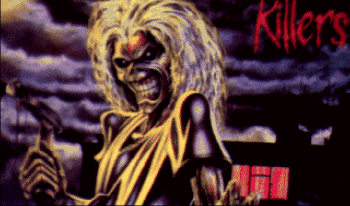
These two show off adaptations of the cover art to 1981's "Killers" album, the first on C64 by the Bruehe Cracking Crew...
and the second from an Amiga slideshow by Accession. (If you just can't get enough of the Killers art, you can also find it on the cover of a ZX Spectrum shoot-'em-up, Bedlam!) (That was my own original research! I'm really enriching the corpus with all this, uhh, data.)
The Bruehe Cracking Crew strike again with another c64 production featuring not just the Iron Maiden font, but also what appears to be some early digitization of Eddie.
Commando Frontier show Eddie in a patriotic mood here (yadda yadda uber alles) on the C64...
... and here Argus presents the cyborged Eddie seen earlier with a bit more anatomical context.
Another C64 production by Electronic Counter Measure shows a similar Ed Head with reflected features and, er, floating in place like a sinister Death Star. (I know, you thought the Death Star was already sinister to begin with. Well, you ain't seen nothin'!) Also, further use of that distinctive and appropriate font.
We continue with a closing run of disembodied heads, which doesn't even faze Eddie, who is, after all, a head. This version was done for Amiga in 1989 by IT.
This one is by OKS Import Division, also for Amiga, the year before, and shows that Eddie had a somewhat rougher time with the head extraction this time around. (But at least he's prepared to lend a hand. I'll be here all night, folks!)
This one looks fun -- an Amiga production in 1992 by Laser Dance. (I thought that perhaps the Eddie Heads were doing a laser dance, perhaps in some grim discotheque.) Nice work on the Iron Maiden font!
And finally, one I have to end on because no one is going to top it: Commando Frontier's 1990 "The Clairvoyant" from 1990, again, with the font just about solved:
Thanks for sticking around for the second act! If you find you genuinely can't get enough of Eddie the Head, you can always try playing one of his two official licensed game appearances (from cracktros in the '80s to the main attraction today!) -- 1999's Ed Hunter or Iron Maiden: Speed of Light from last year!Congratulations, folks, in appreciation of your devotion and persistence to this niche subject, the long tail has delivered us an ANSI art coup de grace by Soul Assassin:
(and a nice little infofile header from the 22nd Fuel pack in July of 2017!)
(OK, Fuel continues delivering: The Knight delivers another portrait two months later:)
(And The Knight of Fuel continues being a one-man Eddie the Head cottage industry:)
And who knows, I may continue adding new pieces by The Knight here until the cows come home, but such a gallery is never truly complete until graced by a Horsenburger teletext screen, what looks to me like a take on the Killers album art:
... and one of The Trooper:
(For later sorting, a handful of further very early underground ANSI pictures:)
The 16 Colours AOTD found one I'd missed, a 1994 iCE illustration of Eddie by Genesis:
... and Nail was kind enough to point me to a C64 intro I'd missed, 1989's Bound To Be Best by XAKK:


