I was concerned at one point that this blog was running the risk of suffering the fate of my previous blog on related matters: being taken over by my seemingly endless series of "Video Game Textmode Art" posts, which I long since stockpiled enough material for dozens of posts on. My recent burst of activity has ducked that bullet however -- in fact, we're nearly halfway through the year, and I've only made one addition to that series so far! Maybe I should be more afraid of never getting through it. Maybe next time! First, I have a wholly compelling tangent to take you all on:
Back in November I stumbled upon a page on the vast and endlessly-fascinating textfiles.com complex (which we have
visited here before) that was just a big contextless glomming of
piles and piles of PD (Public Domain) ANSI art -- converted to .PNG for easy browser viewing, largely dating back to before the format's adoption by underground elites circa 1992. (What Jason Scott's intention was for this page I cannot presume to speculate; however I have found it to be an endless font of inspiration!) It was jarring to see such a well-known and much-loved idiom used so extensively and to such (ahem) varying effect years before it popped... it was a feeling not entirely dissimilar to the creepy tingle an author experienced
encountering proto-textmode art poring over microfiche transfers of 19th century newspapers.
This heap was in desperate need of some curation, so I have shaken it down in a few different ways and look forward to presenting you with a few groomed posts exploring different themes of ANSI artwork back in the TheDraw, 1200 baud, pre-artscene era. Otherwise put: What On Earth Did People Draw In ANSI Before Image Comics Were Invented? (In a nutshell: in 1992 seven artists on Marvel Comics' top-selling titles -- notably Todd McFarlane (Spider-Man), Jim Lee (X-Men), Rob Liefeld (X-Force), Marc Silvestri (Wolverine), Erik Larsen (The Amazing Spider-Man), and Jim Valentino (Guardians of the Galaxy) -- felt (likely very correctly) that they'd gotten a raw deal and could do better in an independent comic book house, one which enshrined Creator's Rights and had better royalty rates. In turn, they gave us Youngblood, The Savage Dragon, Spawn, WildC.A.T.s, Cyberforce, Shadowhawk, and Wetworks, and shortly thereafter titles such as The Maxx and Pitt. And anyone who has ever looked into an artpack has seen art from these particular comic books hundreds of times. From the very month they began publishing, Image's eye-candy characters immediately wiped the slate clean of virtually every other subject (barring Calvin and Hobbes) an ANSI-drawing kid might try to commit to pixels. Solely judging from the contents of artpacks, you might be forgiven for thinking that Marvel and DC had gone out of business at that point. Moving along!)
There are some formal innovations that simply hadn't occurred yet in these pieces: until the release of ACIDDraw in April of 1995 (which denizens of the Public Domain would never even have known about), TheDraw limited artists to a single screen of 80 columns by 25 rows (technically 50 were available in a rarely-used mode, but in practical terms this was never used.) They were big on block colours, weak on shading, weak on use of half-block characters, and rarely outlined. By and large, the aspiration seems to have been: "Can you tell what this is supposed to be?" rather than "Does it look good?" But then, small-scale ANSI art production was always difficult -- a different set of minimalist constraints than those the artscene ended up selecting to work around.
This art isn't simply different because of aesthetic sensibilities and the crudeness of available tools, however: it points to a radically different psychological profile of an ANSI-drawing computer user in 1990 from the disaffected "Lone Gunmen" skeptical cyberpunks we think of populating the mid-'90s digital underground: they loved their local sports teams and cheered for their country during the Olympics, read the funny pages in their daily newspapers, celebrated holidays gushingly, and were big boosters of the military (and strong detractors, in turn, of Saddam Hussein.) They're only recognizable as members of our geek tribe at all due to their fondness of Star Trek! The closest thing to an edge any of their tastes might hint at is an affinity for the (contemporary) works of Patrick Nagel. They were sentimental and disgustingly earnest, and felt excited to share primitive digital farts they'd made which a later artscene dood would have sooner died than have their name associated with. You'll see all these sides of them in time, but today we're examining their musical taste.
They didn't listen to techno, because that hadn't reached the mainstream yet; of the rock styles of the '80s, you see quite a bit more representation from the metal than the punk side of things... they don't acknowledge country music at all and their awareness of black music -- R'n'B and the emerging rap phenomenon -- is vestigial at best, nodding only to the contemporary titans simply too big to ignore. Basically, Homo Publicdomainicus, a Joe Six-Pack type, listened to top-40. Love it or leave it!
And like some obsessive fan before the days of instant gratification found in interest-shared online forums, they expressed their love in a fashion not dissimilar to smoke pit kids talismanically scrawling band logos on high school trapper-keepers and jean jackets in ballpoint pen and Sharpie marker or carving them into classroom desks with compass points. These icons and logos were potent magical glyphs broadcasting out to the world that you were not a bloated Eagles fan, you were hungry for the next new thing -- Mötley Crüe. Or Billy Joel. Or what have you. The folks online at this time spent their hard-earned dollars on a curious and expensive hobby, but apparently one that in no way slowed down or interfered with this overall practice of using band iconography to trawl for kindred spirits.
(NB: for purposes of this feature, I have also dipped into the first couple years of artscene artpack releases, as until the Image Comics scroller upheaval their development of the artform was merely evolutionary, not revolutionary. They were still making largely single-screen works in which band iconography figured prominently, and both of these would change drastically as underground ANSI art grew into its own style.)
"You like rock music, no? You enjoy eating hamburgers sitting near memorabilia? Shoe thrown at Liam Gallagher? French toast bitten by Lance Bass? Here: call Hard Rock Cafe - Telegard. Chain Letter forwarded by Ted Nugent! Cindy Crawford swimsuit .GIF uploaded by Nikki Sixx! PimpWars played by Snoop Dogg!" (He renames the grill Flaming Shizzle's.)
So, if you're really into music, I mean like
really into it, you probably have a favorite record label, right?
And if you had a
really favorite record label, why wouldn't you make an ANSI version of their logo, right? These are almost carbon copies of each other but there are slight variances. There's no reason to believe one was adapted from the other, but rather that there are only so many ways to render the logo given the constraints imposed by the medium. JC and Michael Arnett (a name we shall be seeing a lot of here) are just cases of parallel evolution in this case.
Atco Records, make up your mind: are you selling records or CDs? Mike Arnett can swing either way, just let him know.
Atlantic? Yeah, they had a few good artists also. But do you have anything really
classic? (Two more by Michael Arnett -- I'm not sure if he was a music-ANSI specialist, but he sure turns up here a lot!)
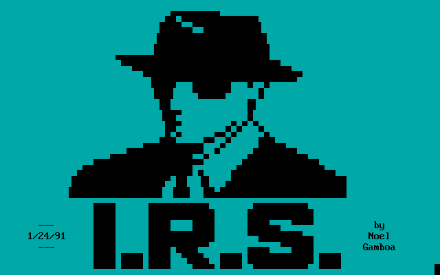
Ah yes, The Victor RCA "His Master's Voice" dog-on-a-coffin-listening-to-a-phonograph. How droll. Why do you think that a painting from 1898 might be poorly suited for the artistic medium of the computer age? Nothing could be further from the truth! I'm not quite sure what's going on here with the gramophone horn colour shading the foreground lettering, but I dig it.Noel Gamboa does an excellent job rocking the stylish I.R.S. Records logo:
And of course since pop stars were no longer merely an audio phenomenon, we can also celebrate their recorded images. Michael Arnett gave us a fair reproduction of VH1, the successor channel to MTV:
OK, let's move on to some bands now. Begin at the beginning, with the "A"s: this one is a perennial favorite...
Sure, that's
a logo for AC/DC (credited to: "Greylens", which might explain the greyscale palette choice), but have you got something a little more iconic?
Now, can I get it in the full context of an album cover? Much obliged! (By George Ramos Jr. -- I wonder what kind of computer art the old man did, maybe RTTY portraits?)
Got any other AC/DC songs in there? (By Dirty of Hipe -- with a handle like that, it was basically inescapable that he'd wind up doing this logo at some point.)
All right, moving right along. Cramming all those letters in there is a feat in itself, and then you consider... where the heck
was Aerosmith in 1990, anyhow? Making guest appearances on Wayne's World and the Simpsons? 1989's Pump was going somewhere, but Get a Grip was still two years ahead of them at this point. (Irrelevant aside: during that period in late '92 when they were recording GAG at Little Mountain Studios, my mother taught kindergarten to one of Joe Perry's sons... which must've been around when they recorded a cover of Oscar the Grouch's "I Love Trash" for a Sesame Street tribute album.) KEITH ARENDS didn't care: HE LOVED AEROSMITH.

OK, another band logo, please! Like record-store bins, we're going alphabetically, which leaves the "A" section a bit top-heavy. (as in the video game industry: Apple would appear before Atari in the phone book, but then Amiga would appear still earlier; ditto for Accolade, who would appear before Activision, who were then scooped by Acclaim... then Absolute Entertainment hits the scene. But we haven't yet reached the Metallica/Megadeth part of this list! The Beau Brummels (unrepresented here, unsurprisingly) pulled a similar trick on the Beatles too...) (And people thought that artscene kiddies were petty and filled with drama!)
(
The underground's take on the same subject has more of what could be described as "raw energy".)
Chameleon GFX lives up to its name: parts of its logo assume the colour of its background. No, it was drawn, for reasons that may ultimately be known only to Chameleon, using flashing characters, resulting in a logo that was never 100% visible unless you employed the PD-unknown and not-then-invented-yet iCEcolour innovation. (A pain in the neck to capture accurately as .GIF animation. Can it be done? Sure. Is it worth the trouble? Not hardly!) Deeper meaning? Allegorical connection to the spearhead of the British Invasion? None that we can find! The positions of the musical note characters on the staff? Random and arbitrary! Is there a better logo we can use? Coming right up!
This... is an improvement. The subject demands Sgt. Pepper excess, but the medium really would be working against that.
I couldn't place the likeness (creative hair effect, Mike!), but if this follows suit with his other works on the theme, it's probably Belinda Carlisle of the Go-Gos. Apologies for the glitch in the top row -- I painstakingly fixed a bunch of these in post-production, but a few bugs slipped my net. (These files hadn't been downloaded so much as their display captured; their source ANSI files are that of a picture display incoming in a terminal program, dumped to a file. But with no error correction, if your modem made a hiccup (or heaven forbid someone picked up the phone by accident!) and the display glitched a bit, so did the end document. And 25 years later, these glitches would be enshrined and redisplayed with striking fidelity!)

Noel Gamboa couldn't fit both the subject and its logo into the same screen, so he just layered them. I think you made the right choice, mate. This flat style of ANSI art is all outline, no texture, but it gets the job done conveying the bare bones of iconic likenesses.
Billy Joel isn't honoured with an ANSI likeness, but his iconic tune at least is commemorated for the ages -- not just its title, in what appears to be an unusually colourful stock TheDraw font, but its tune! Not in the sheet music score doubled here, but in the perplexing line at the bottom: notation for ANSI music to beep what I assume must be a hook from the song out of a PC Speaker! ANSI music was a very real part of the PD ANSI scene, but an aspect of it that, as best as I've been able to ascertain, was utterly and without exception rejected and buried by the more glamourous underground artscene that followed it!
You've got the wrong idea about me, guys -- Eclipse of Dead didn't even know this WAS a band's name, he just liked the witch rituals! Points for the creative attempt at condensing the final three letters into two. So, the SysOp was named Sabbath... what do you think the odds are that he celebrated Kwanzaa? (I rate them as ... slim.)
Michael Arnett reminds us of another British band we'd long since forgotten (just kidding, actually this is the first I've ever heard of them!) The Blessing:
Jan was a fan of '80s metal band Blue Tears, and he has the ANSI art to prove it:
Greylens strikes closest to the mark perhaps here with his version of the logo of the band Boston. I've seen the rest of his logos -- it's more than a feeling:

Michael Arnett's portrait of Cher presents an interesting case study among these artefacts: by 1991 her career trajectory had pivoted wholeheartedly from singer to actress, but here she is being committed to textmode blocks at this moment in time anyhow as though she was hugely relevant at that moment. (I was alive and awake at the time and my first contemporary awareness of her musical activity was her duet with Beavis & Butthead in 1994.) Maybe Mike is celebrating her success on the silver screen. But as on we go through the list, we observe that though these ANSIs were being made in the late-'80s and early-'90s, a lot of their subjects peaked in the '70s or even '60s (while genuine '80s phenomena such as Michael Jackson or Madonna are perplexingly... nowhere to be seen.) The underground artscene might have championed the new, but the PD artists seemed happiest enshrining established successes they had already known and loved for years.

Update: OK, maybe the public domain ANSI artists weren't so square after all: here's the cover art from Misfits spoiler Glenn Danzig's first album (and gee whiz, that's
a funny origin story for the album art!)
(Updated update: Blocktronics did an artpack of ANSI art album cover adaptations in late 2017, and
this specific subject was revisited by Nail -- the additional decades have allowed him to deliver a superior rendition.)
r" style="clear: both; text-align: center;">

This artist was a bigger fan of Debbie Gibson's songs than they were of typography, driven to ... just get the tunes' names writ large somewhere,
anywhere... the content was more critical than the presentation.
It's telling that of my two main hobbies, computers and accordions, accordion has by far
the more impressive tribute to Deep Purple. What were these guys up to in 1990? Languishing, it seems: "Deep Purple was approaching death in 1993. Audiences were falling off, we were playing 4,000-seaters with barely 1200, 1500 people in them." But I guess it was their prior achievements that earned them a bona fide ANSI logo.
Roll call! Here's the thing: Jim Morrison died in 1971. Some time later, I was born, eventually traveled to Paris, and saw his grave in the Pere Lachaise Cemetary. And then... his band was considered to still be such a potent cultural force that someone decided they needed to be immortalized in ANSI art form. (Oliver Stone's 1991 movie about the band likely had a part to play. And, I'll concede, anything worth spending millions making a movie about probably rates a measly ANSI logo too.)
But two logos? While the earlier logo boasts a more canonical logo depiction, this one has the virtue of having been seen doing double duty listing a bulletin board's door program menu.
Bonus: a portrait, by Orenda:
OK, while not exactly famous, Dread Zeppelin -- the Led-Zeppelin-songs-performed-in-a-reggae-style-sung-by-an-Elvis-impersonator high concept project, was at least timely in the early '90s. Maybe Noel Gamboa was a friend of one of the band's members.
Who the heck was Elton John in the early '90s? The first moment I ever recall being aware of him doing something (as opposed to having
done something,
a long time ago) was his appearance at the Freddie Mercury tribute concert in 1992, dueting with Axl Rose on Bohemian Rhapsody (and then sharing a hug with Axl afterwards, as Axl looked like he was trying very hard to avoid spewing chunks.) His opportunistic turn at Diana's funeral and even the Lion King were still years ahead when these PD ANSIs were presumably drawn, so again it must be considered another case of getting famous and coasting on fumes. (This minimalistic PD portrait style is interesting, as you can take the basic facial type of the Billy Idol, above, and add glasses to get Elton John. Well done, ANSI-mation! PS, your name would go down in the annals of textmode history as something completely different -- animated ANSI art -- from what you demonstrate here.)

Michael Arnett, who probably had a little more practice at this kind of thing, at least gets a certain flamboyance into frame with the outfit and the glasses, but I'm sad to say that the logo is a little over the top. (I do appreciate, however, the piano key background in the top left.)
We've seen Tortelvis, and now Mike hits the nail on the head with the genuine article: RIP Elvis Presley, 1977. But in 1990 Living Colour released "
Elvis Is Dead" (whose letters, if you squint a little bit, you can almost make out in the glitter), so clearly he was still burbling his way through the cultural subconscious. (Heh, you can enjoy
a locally-produced tracker .MODule inspired from that song as a bonus track in our EuphoniX collection released one year ago.) Also: the different stage lights can make! Compare Elvis' pale visage to Elton John's ruddy complexion above! ANSI offered numerous passable skin tones, but no great ones.
Finally! All my comments about timeliness, and then this, Fine Young Cannibals in 1990: peak freshness! Well played, Eric Erway! Sadly, I believe this is your only appearance in this gallery, but you had your finger on the pulse, sir!
The PD artists, as we have seen, had no concern for their celebrated acts being on the right side of their "best before" date, so I'm wondering what it was that made the underground artists so much more keenly conscious of current trends. Of course, they may have just been younger -- we've all heard the hand-waving about how people stop listening to new music after the age of 30 -- and I like to think that their subculture's obsession with "freshness"... not in terms of novelty, but rather the way that warez were measured on a 0-3 days scale... may have played into things. The PD scene was a relishing of the status quo, loving the things you knew you loved, while the underground was much more an endless game of one-upmanship. They just needed to be conversant with "the new shit" simply in order to keep in the loop.

This is kind of a case in point (by Primal Scream) for the timeliness bit, but Jerry Garcia at least had three more years on the clock remaining at this point. You would see rockers with Dead badges on their backpacks for a while yet.
(Bonus!)
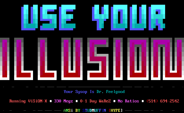
No explicit Guns 'n F'n Roses ANSI art here, but this board's name is a reference to one of their albums at their peak. But, uh, paging the SysOp: you disgust me. Get your act together! You've gotta make up your mind, GNR or Mötley Crüe? This font, from a Hype artpack circa 1992, is just beginning to break out of the TheDraw ghetto of squareness: a bit of 3D layering, some dark-to-light and light-to-dark gradients... but where exactly is the light source supposed to be located relative to the logo? I just can't work it out. Studmuffin, you have much to answer for.
Greylens likes Heart, some good Pacific Northwest content. Well gee whiz, isn't that sweet: the word "Heart", a heart logo, and studded with the heart character. But the literalism is laid on a bit thick: I think a barracuda would have looked more interesting. I had these issues when I was making gig posters also, but he had no reason to draw this ANSI except he felt he had something to express about the band. He failed to express anything about anything other than the word "heart". Alas! Keep trying, Greylens!
Michael Arnett, your failure to realize a Michael Jackson ANSI is here emphasized by the fact that you had a perfect Jackson face already done up with Janet, all you would have needed to do was change the hair, add one glove and maybe lighten the skin tone one notch. (1990 is the exact time period for the first dramatic "OMG what is he metamorphosing into?" realization.)
And now for a little mystery: not bad, Manslayer of SDA!
Wait a sec -- if Manslayer did the psychedelic effects here, then who did the portrait the first time around? And was he previously just taking credit for the logo?
(Update: I never realised that the strangely yellow rendition of Hendrix was taken directly from the album cover of "Electric Ladyland" until I saw
Whazzit's superior ANSI art rendition of the same subject at the end of 2017. Formidable!)
Purple Haze -- the low-hanging fruit of illustration. If you can't draw one, you're not really trying.
This one by Doc of Dead for Electric Ladyland I like for its circuitboard qualities, evoking
the "gynoids" of Hajime Sorayama (VERY '80s) in a way that was presumably entirely unimaginable at the time of the phrase's minting.
With the limited palette and iconic shapes of their stage make-up, you'd figure that KISS would be a shoe-in for ANSI immortality. But no, all we get is their logo. (I'm glad to find that I'm not the only one to see the similarity of their closing two letters to the insignia of the Schutzstaffe.)
Ah, Greylens, so we meet again! Still dabbling in the realm of band name typography, but now on the ASCII side rather than the ANSI end of things. These ornaments and flourishes are, if non-canonical, pleasant enough I suppose. But is there anything more, I don't know,
iconically Zep out there?
That's more like it! (That angel is not from the cover art of HOTH, but I'm not going to split hairs. Well, not on that particular matter!) This is from am underground art collection, by Eternal Darkness of Dead (cheery sorts, weren't they?), still in 1992 occupying a developing place between the aesthetics of PD ANSI and the underground art styles yet to come: the typography is fully early modern, mixing all kinds of blocks and not occupying a strict grid of right angles, while the character in the background looks almost the result of a GIF2ANSI process outputting only full-block characters (but then dressed in a sash to preserve his dignity.) And it's a kind-of scroller, longer than TheDraw on its default settings would allow!

As for this, well, I just couldn't resist. A fan-made level for the textmode game ZZT named after a Led Zeppelin lyric, promoted with an almost-TheDraw-calibre ASCII logo? It didn't quite belong, and yet I couldn't leave it out. Presumably by Leonard Richard of Hareware.
I wasn't sure about this one by Necromancer of Grim, which is obviously making nods to the metal end of things, but which band had a moustachio'd skeleton as their mascot? (Is that even a moustache? It's hard to know for sure when you use the same shade of grey to denote sunglasses, chain links and facial features.) It reminded me of the recently-late Lemmy of Motörhead, but the quote points us to Megadeth, whose mascot is indeed a charismatic skeleton -- though usually one with a closer shave. It's not quite clear here as
I have diverted the single most popular specimen aside for another post exclusively about him, but the one area where ANSI artists, especially the kids of the underground, made sure to celebrate artists who'd been active in the last decade was
metal. PD aficionados of classic rock hunkered down and entrenched themselves in their golden eras of the '60s and '70s, but the kids were touting extreme and edgy acts that were current and vital phenomena at that moment. (A handful of them, at least; conspicuously absent in this list are "Monsters of Rock" tourmates Judas Priest, Twisted Sister, Queensrÿche, and ... where the hell is Metallica? Maybe the scenesters rejected them for selling out after their breakthrough success with "Enter Sandman" in 1991.) (Edited to add: ah,
here.)
Trans-X's 1983 "Living on Video" might seem too obscure to inspire a piece of ANSI art, but here it is. Is it a frame from
the music video (in which a Commodore PET figures prominently!) or just a piece of inspired whimsey by the infuriatingly anonymous KT? Unclear. But it's a fair sight prettier than everything else here, so let's not complain!
And here, out of left field, our single candidate for Southern Rock -- Lynyrd Skynyrd, tragically quashed in a plane crash in 1977, and therefore an excellent (?!) candidate for PD ANSIfication circa 1990. Thanks to JC for taking on this wholly necessary work! (Heh, I'm one to talk!)
The band is a bit before my time and I gather they haven't aged particularly well, so I don't have much to say about Mötley Crüe. I do like the cursive (but why is the y looping back to join with the o?) however -- are those melty little marshmallow skull-and-crossbones in the corners? When you get to the point that you're using little black-on-grey slashes to suggest fine details, you might have gone a little
too small-scale. The banding shading effects are, uh, novel.
This is the kind of thing I drew in ANSI (well, iconography of esoteric mystical cults, but it's not that different) before convincing myself that I had zero aptitude for the form. The PD ANSI artist is drawn to no such conclusion. It's not bad for what it is, though it is trying to pack in a little much into such a small space (resulting in some weirdness with eg. the snake coiling down to the blade's tip, then its head appearing up the other side, and yellow is probably overused atop the wings -- hm, I see that some of the problems here are also present in
the original album artwork which, I see, also explains the skulls and ligatures discussed in the previous comment.) I don't think you're ever going to convincingly carve an M out of a 3x2 grid; any attempt will necessarily involve those nasty F9 characters and just look like one of those Es rotated.
Who the hell are Night Ranger? Guess they were a thing. Nice pseudo-3D vanishing point perspective with the ASCII slashes, JC!
"ANSI-Mation!" gives us a logo for the British '80s band The Outfield:
Thrasher is demonstrating his oldschool cred here: setting up Pearl Jam in a "Mother Love Bone" context, which would be absurd anytime after 1990.
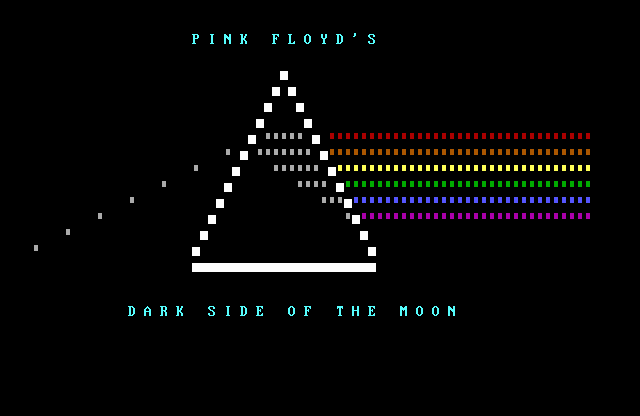
No parade of Public Domain ANSI art is complete without an appearance by the form's master, Ebony Eyes, who represents here with classic album art (which there must be other, inferior, ANSI versions of) (
case in point) from Pink Floyd's Dark Side of the Moon then, for kicks, includes a complete track listing and a Dolby Sound logo. Curious how the outer bands of colour alternate between high and low intensity every half-row, but the desperate workaround to accommodate structural failings of the ANSI art medium, boldly presented as a creative choice instead, lends the composition some dynamism. Play a wrong note, then play it again louder like you meant it!

Now, I don't know that this is actually in reference to Pink Floyd's rock opera The Wall -- the logo is similar but different -- but even if it is just a reference to any old graffiti wall (a frequent passtime for a friend and I in childhood: filling a MacPaint screen with the "brick wall" font and using the "spray can" tool to scrawl tags and slogans all over it. But when I suggested we print our creation: what? that's basically printing an entire sheet of black ink, do you have any idea how expensive and wasteful that would be?) I couldn't resist slipping it in here. Given the odds that RaDMaN may be making a cool reference to an antiauthoritarian masterwork, I give him the benefit of the doubt.
A curious choice of framing -- pictured: mystery yellow steam door in the ground;
not pictured: bondage babe crawling toward it on hands and knees. Maybe George Ramos Jr. wanted to keep his PD ANSI art PG as well... coming from an underground artscene perspective, it seems a baffling decision to
deliberately omit cheesecake. (This guy would not have been allowed into Integrity!)
I had not previously heard of Sad Cafe, but when looking up the source of the logo I was blown away by how the logo (which despite being offbeat and charming enough in isolation, it turns out is quite clunkily converted Bizarro-style, with all curves railroaded into straight lines) is by far the least interesting element of
Misplaced Ideal's album art, which was quite eye-opening!
Michael Arnett returns with another blast from 1990, Sinead O'Connor circa her monster "Nothing Compares 2 U" cover. The likeness is, ehh, not great but you can only achieve so much in 25 lines; the echoed silhouettes on the left are a successful creative risk I think, the radiant shading on the letters less successful perhaps.
Update: meanwhile, in the UK, on teletext -- a 1986 ad for the Smiths' The Queen Is Dead...
And for all the dads out there, Greylens returns with a stock by-the-book blocky logo for everyone's favorite jazz-rock band Steely Dan. I cannot really envision any circumstance where this logo would be called for, but these artists aren't hampered by my bougie failure of imagination.

Remember back when Sting was cool? OK, me neither. (I remember when he was Feyd-Rautha Harkonnen, which is almost close enough.) JD is probably thinking back to his work in The Police the first time around (which had been cooled off for several years by the time our imginary common time of 1990 came around) and maybe not celebrating his reinvention as an easy-listening adult contemporary rising star (then again, maybe he is). The arrangement of the piece puts me in mind of a "Think Different" portrait of Steve Jobs, but that... is not Sting. There are some issues with the portrait -- the line below the lip is one, but the near eye's implied outsized disproportionality is the biggie. (And what is that grey swoosh along the left? First I thought he was leaning his head against his hand, but apparently not so.) My main stumbling block is that my primary identifier for Sting of that era is his lionine mane, all of which is cropped out of frame here. (And, sorry JD, but the logo isn't doing him any favours.)

Greylens, you're halfway to an authetic Styx logo... but this one is just half-baked. (Is it recognizable? Done, upload it!) The angles are inconsistent, the line width irregular, the letters mere outlines... convincing yourself that this was good enough would be a ... Grand Illusion. (Sorry, sorry.)
What on earth was Tom Petty up to in 1990? The Traveling Wilburies, perhaps the act least suited ever for ANSIfication. This likeness by Michael Arnett isn't bad, but I wonder about the decision to leave the whites of his eyes as grey as the rest of his clay-like pallor. The lock of blonde hair on the left side looks a little bit like his forehead has sprung a leak and a shower of liquid gold is spraying out. Why not connect the left leg on the M, Michael? Why?? (Also: drawing a fade-to-black border on the right edge, then realizing that you still have a column left and adding a stripe of bright grey.)
Some anonymous fan liked U2 enough to make them a coloured line-art ASCII logo, but not one that was any damned good:
Hey, could I get an ANSI version of Van Halen's logo, set against the minimalist design of their 1982 album Diver Down?
OK, but the wings are missing a layer and the commitment to making the letters' bottoms as pointy as possible is a little disconcerting. Could you fix that? Doesn't matter if it's a bit chunkier. Much obliged! The public domain provides!
While we're in that frame of mind, hey, Michael Arnett -- how about the clip art devil from David Lee Roth's 1991 solo album "A L'il Ain't Enough"? (Apologies -- due to the method by which this piece was initially captured, the file begins display a couple of lines higher than is seen here -- but then scrolls up, making those lines disappear. Our record of the piece isn't of its own source file, but its display being captured in a 25-line terminal.)
It's been a while (Janet Jackson?) since we've seen a portrait of a human with the skin tone of a human. Here JCL has drawn one. It's not a bad picture! Do you recognize her? Do you know who she is? Fortunately JCL has been kind enough to throw us a bone in the filename: WHITNEY.ANS ... making her the late Whitney Houston! Here she had practically her whole career ahead of her. In ANSI art you live on eternally as forever young! (At least, until your file format becomes completely unintelligible to modern machines.)
Moving right along, a taste of something new from Greylens! This is not the canonical Whitesnake logo, though it is white and does feature a snake. Boxy letters, buddy, but creative use of ascii characters to put a scaly texture on the snake! I'm guessing that that tongue would originally have been flickering in and out (by which I mean being a red line flashing against a black background.)
The unsubtle G. Zornes (with a name like that, there's no point in shooting for nuance) hits us with a logo for the American heavy metal band Winger:
Yes' album Big Generator came out in 1987; I don't know how long it had been out before Greylens again felt he needed to commit its straightforward design to the ANSI art medium, but here it is: letters against a yellow background. Not really much room to excel or distinguish yourself with this one -- it's kind of like doing an ANSI of a stop sign.

From A to Z, here we are at the end of our grand alphabetical promenade through the pop music alphabet of 1990! The capture of this one was cut off (and in so doing, neatly datestamped: this display was captured August 27, 1990) but I feel confident in assigning its creation not just to any old Michael, but our old friend Michael Arnett. It celebrates ZZ Tops' anthem "Legs" in what appears to be a wholly original but completely appropriate fashion: lady legs flouncing in high heels (with colour-coordinated skirts) of three brightly coloured varieties, against a backdrop of sparkly flashes (camera flashbulbs?) and a classic car (Billy Gibbons' "Eliminator" 1933 Ford coupe?) The intertwining of the twin "Z"s bugs me, but it's on-and-off canonical, so I can't complain to Mister Arnett!
Now as a bonus, some musical teletext from Horsenburger -- Gene Simmons' tongue from Kiss, Morrisey of the Smiths, and David Bowie as Aladdin Insane:
Stop! Hammertime! As a special bonus for getting through all that, I was filtering out the rap to present as a special supplement here at the end! Michael Arnett delivers the goods again! I like Hammer's severe urban haircut and stern Malcolm X gaze through his glasses, as though this is a dangerous man to middle America. (The jumping dancers in the background are the icing on the cake)
All right, enough of the warm & fuzzy Hammer nostalgia: do we have anything by a serious rap artist?
Let me, uh, ask that question again. (Tank of ACiD -- for the underground was always hipper, if only slightly so in this case, than the PD world -- works hard to do much with a simple logo; the cancelled-out Ma Bell icon makes me wonder if Tone-Loc's handle had anything to do with phreaking?) And now we hit the rap revolution that ripped through the underground ANSI scene, possibly more consistently than any musical act before or since:
Tank strikes black with another ACiD joint showing that his tastes could run a little more to the hardcore. Public Enemy's provocative imagery was like a jolt from a 12-volt battery to sheltered computer kids. I don't know about the use of paired F9 characters here to provide the holes in the letters, but I was never an ACiD ANSI artist so what do I know?
Ren of Mirage was another underground Public Enemy fan. The iconography is stark, dense but simple to render: a perfect candidate for ANSIfication!
Here Shadow Demon of AAA, the precursor of ACiD, presents us with the purplest Flava Flav imaginable! It's like he's a human-shaped shiny eggplant, like some enemy out of Kid Icarus. But cut him some slack, we all know what is possible with only 25 lines to work with (ie: not much!)
And one final AAA Public Enemy nod from a young man we can expect great things from: RaDMaN! Four words, four different font styles. (That "is" almost wants to be a swastika.) When I see a slogan like that coming from a source such as this, I always wonder if there's a subtext to it criticising the frail and insecure telephone networks. And that's a (w)rap!
OK, are you ready for a joke?
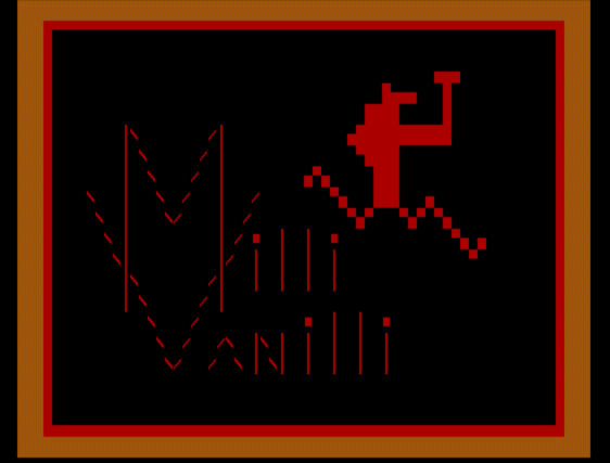
Our man Michael Arnett delivers! Is the subject any good? He doesn't care: if it's popular, he will ANSIfy it. Nice job on making the letters icey, though the blurring together of the "L"s in Vanilla makes me think they're made of melting ice cream bars smooshing together. But that's just the pre-punchline: here's the real funny stuff. Hope you enjoyed this post, survivors of the '80s!


#/media/File:Motley_Crue_-_Dr_Feelgood-front.jpg)


haha man, that "Tone-Loc" ansi was a piece of "phreaking software", a war dialer to be exact if memory serves me right. So you were right, that's what the No-Ma-Bell part was for.
ReplyDelete