I've long intended to do a round of that game here for this new blog, which originally had vastly more diverse intentions than the "textmode video game art of the week plus garage sale finds" it's recently boiled down to, but this morning I remembered my long-forgotten aspirations and banged one out while the baby was napping. Do any of these letters look familiar at all to you? Do you have any idea which games they were copied from? I will also stump the brains over at MobyGames, but to give you a fair chance I won't share their complete attribution for at least 24 hours. (Bonus points if you can also place the background image!) Cheers!
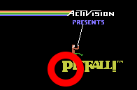
*** OK, it's been a week, it's time to bust this puzzle open. The first successful guess took 20 minutes (Terok Nor of Mobygames, pegging the first I and the M), and the final one took, well, about a week. One I had to spoil myself. I've done this game a few times and I always learn a little bit about what I think is too popular, or too obscure; sometimes a logo is iconic on certain hardware only, but that may not be the hardware on which its game became a killer app. (In this case, I used two start screens from Coleco ADAM versions of games. Who on earth had an ADAM? You in the back, put your hand down.) Getting things off to an easy start, Perfect Dark was a monster game, and it's easy to place a letter from the start of a logo when it's used in the start of another logo. (Case in point!) I had to pluck this logo from outside of Mobygames to omit some cluttering "press START to play" game interface from the Earthworm Jim logo. All the same, it's a bit of a dead giveaway. It's practically a rebus! Video game history does not furnish you with a great deal of Xes to deal with. This one from Zaxxon is, it turns out, only iconic when paired. I don't know if there is any more flagrant an E in video game canon than the bold luchador-styled one at the end of the Viewtiful Joe logo. It's hard to make the closing letter in a logo go out with such panache, but when the word has only three letters it's a bit easier. I was truly not expecting anyone to get this "L" from Zool, the least interesting letter in its logo, but it only took chirinea 7 hours to place it. This logo is so great, it's just a shame that it only appeared in the Adam version. (Chirinea had been poring over other platforms' start screens, but somehow missed this one. I had to spoil it in the end.) This iconic Donkey Kong letter I fixed up for my purposes -- photoediting some reflection to eliminate the letter-overlapping and giving me a complete letter to collage with -- and that threw some seekers off the trail, as it is not how the logo appears in its context. Mea culpa! The Wing Commander font is so iconic, it's actually almost difficult to place, an instant futurist cliche. After using it, I realised that I have actually drunk from this well before in a prior collage. But how could I resist? I didn't realise until too late that the Super Mario logo used here in SMB2 was also a stock logo employed in SMB1 ... the chunky "Super Mario" font that has been so entrenched since Super Mario World made me forget that there was ever a previous "standard" typography for the series. When I cropped out its background colour to facilitate collaging, it became impossible to tell which of the two games it came from. I hardly needed to draw a red circle around this E from Goldeneye, but here we are! The logo otherwise is pretty unremarkable, but I feel OK enshrining the exceptional. I was sure that Reset Survivor, artist of so much Jet Grind Radio fanart, would be able to place this letter from its logo, but he stalled after correctly sourcing Viewtiful Joe. Chirinea missed this one after wrongly focusing on the first of its two "i"s, but then caught it (in a matter of minutes) when I hinted that the letter came from a game released in the year 2000. File under "classy ways to wrap a logo": stick a katana through it, Samurai Shodown! And for bonus points, I set the logo against a backdrop from Elite... which I had to file away the serial numbers from in order to avoid its naming itself.Goof fun, everyone! We must try this again sometime!


No comments:
Post a Comment