Tuesday, 28 July 2020

Public Domain ANSI Art Spelunking: Superheroes and comic books!

Because this month's MIST0720 artpack collection looks at comics, I recently made a post looking at Public Domain ANSI art illustrations of characters from "Sunday Funnies" newspaper comic strips.  Now I continue in my folly by turning the same lens on the subject of superhero comic books!  These characters require quite a bit less explanation because they're generally speaking instantly recognizable and still going concerns.  A third of the low-hanging fruit we stumbled across are on the same subject, so we open with a little gallery of Batman fan-art.


I'm not sure what's going on with the light sources in that picture, whether Gotham City really is burning and Batman is at the centre of the explosion, but those questions aside it's not a bad composition, with tasteful use of ASCII box-drawing characters for fine detail in deep shadow.  The "Michael" tag suggests to me that this may be an incompletely-captured creation of prolific PD ANSI artist Michael Arnett of "Smile" fame.


Despite space-consuming use of black outlines in the (ultimately triumphant) underground ANSI art style, Tom Bradford somehow manages to cram in an incredible amount of detail in his Batman's physique, with different muscle groups isolated, utility belt and grapple hook gun clearly shown, the contours of a flowing cape indicated with appropriate use of shadow, etc.  It's a pity he exhausted his allotment of detail, because the rest of the scene is drawn in pretty broad strokes, but it definitely tells the viewer where to focus their gaze!


The DoLittle gets points for ASCII art bats and reinterpreting the Batman logo with a Yen symbol at its heart, and for leaving the rest of the actual detail to the viewer's imagination.


Some stark lighting here shows us where you really run up against the limits of single-screen ANSI art portraiture of multiple subjects.  Of course, the limiting factor here is height rather than width, so it's not clear whether focusing on an individual face would have granted any additional opportunity for detail... unless they were in a reclining "landscape" position, recumbent on the Bat-bed.  Robin's isn't much of a disguise here and his nose, I'm sorry to say, makes me think of a dangling gonad.  My apologies, ANSI-Mation!  I say what I think.  


Here's Tom Bradford again and I have to say I think he's just the more talented of the two artists, because he manages to cram two faces in to a single screen, with smaller footprints, and at once do a better job at showing both of them.  It's a very thoughtful Batman and Joker tableau (well, Batman looks pensive, I don't know if the tableau is) with our first (and last) real Batman logo of the bunch!


By every metric, this demented ANSI portrait of the Joker fails, and yet in its very offbeat aesthetic choices (not just StUdLyCaPs but each laugh is drawn in a different, yet equally broken, way.  And his eyes!  And... the apostrophe use for comics there is really mind-breaking!) it helps to convey the fractured psychology of its subject.  I give it a pass.  And that takes us to the end of the Batman gallery!  But what of Bats' chief colleague in the World's Finest?


Well, yes... in 1992 Batman's colleague Superman was briefly dead at the hands of Doomsday.  The bleeding Supes logo was used on the bag Superman #75 was shipped in during Dec 1992.  But it's OK, there are other DC heroes still in the eaves, ready to keep the world safe!


Yes, as you can see, Aquaman was at the ready when called upon to draw an ANSI art logo for his zippy friend The Flash.  Just kidding!  These are two different logos presumably drawn by two different (and unknown) artists at two different times, but they go together very nicely.  By which I mean they're both terrible, but they're about on par with the level of terribility of the other one.


OK, OK.  Enough with the DC comics!  Marvel was tearing up the charts in the early '90s, where's all the Public Domain fanart of Marvel superheroes?  Well, there's this ... creative tribute to the 50th anniversary of Captain America, which would have taken place ... well, it was issue #383 in 1991, with cover art by later DC publisher Jim Lee.  (Its cover art was quite a bit better-executed than this screen, but this has a gutsiness all its own.)


In the late '80s and early '90s, the X-Men were on fire and their breakout rockstar was the Canadian living weapon known as Wolverine, Bub!  If you like drawing symmetrical faces without having to worry about noses (a foreshadowing of a whole wave of Image heroes to come), then his visage is definitely the one to ANSIfy!  I wonder why the breaks at the top of his mask's "ears"?  Good work, Ron Czarnik!


In the '60s and '70s, Ghost Rider was on fire.  Just kidding, he's always on fire, that's kind of his shtick!  This portrait is perhaps our most sophisticated seen so far, with a combination of shading characters used in tandem with the black outlines that eventually defined the underground ANSI art aesthetic (though drawing as early as 1991, the artist is really setting the tone for the successors to follow here.)  Tom B?  Is that Tom Bradford, as seen above?  It seems to be hewing to his high level of quality.  Bonus points for effective use of text characters in the eyes and teeth.  Hats off, Tom! (Ghost Rider never wears hats... they'd just burn up immediately!)


Ahh, Peter Parker, I can see that you slept on your tennis racket again.  Spider-Man is a character with a brilliant character costume design, but one with a fatal flaw: the damned web all over everything.  Try to reproduce it literally and you have already failed.  (Granted, given the "potato balanced on burrito" shape of this composition, it was never going to be a winner.)  Leppa, I'm sorry, you get points for trying but your example is going to have to stand as a cautionary tale of what not to do.


Now dig this!  There is plenty going on here that shouldn't work -- combining a naturalistic fluid pose with an ASCII-character cityscape (the subtle dots on the near edge of the middle building slay me!), carefully balanced on webs made of slashes, but this screen's artist neatly sidesteps the pitfall of the costume's web pattern by... ignoring it altogether.  Excellent use of two-tone shading (the ANSI palette is doing a lot of heavy lifting here), and name-dropping Parker's place of employment really ices the cake.  I don't know if it's even possible to fit any more win into a single-screen Spider-Man ANSI tableau!


OK, we're done with Marvel, but as far as niche cases go, there's still one very important avenue to explore: Mirage Studios' primary export, the Teenage Mutant Ninja Turtles.  ANSI colours don't provide great matches for their identifying bandana-masks, but I'm going to call that one purple, making Stinky's terrapin above Donatello.


Ninja Turtles, especially this cheerful, Archie-Comics variety, must be Public Domain-adjacent... Doctor Who is an exceptionally PD-style nickname.  There's a minimalist elegance to this portrait, which contains everything that it needs to and nothing that it does not.  Blue mask =Leonardo


Here's an ANSI portrait with a little meat on its bones!  You hear about using thick black outlines when drawing underground ANSI art, but in this unusual case, everything that would normally be outlined in black is coloured in, and everything that would ordinarily be coloured in is left in black!  It's a curious experiment in negative space.  I wouldn't want to see an entire artpack of work in this style, but this piece flies on its own.  PS -- weilding dual sai, mask or no it was always gonna be Raphael.  Nice work from Ren of Mirage!  Don't know how your piece fell in with the PD trove, but it sure helps you to float to the top!


Finally, here's a fun oddity, an original superhero in the comics style, drawn by the Public Domain hero artist discovery of this post, Tom Bradford.  I have no reason to believe he ever went the distance and drew portraits of the other members of the Wild Herd, but it's a fun stupid idea.  Congratulations!  to Tom for drawing this picture, and to you for making it to the end of another one of these posts!  When you get a chance, do please check out our MIST0720 artpack collection for some more underground computer art-style takes on comics subjects!

Monday, 27 July 2020

Public Domain ANSI Art Spelunking: the Sunday Funny Pages

In honour of the imminent release of the MIST0720 Mistigris artpack collection celebrating computer art takes on subjects from comics -- comic books, comic strips, webcomics and underground comix, etc. -- here's a patented Pixel Pompeii look at how the same territory was covered by Public Domain ANSI artists of the late '80s and early '90s before the rise of the underground computer artscene.  (Otherwise put, an '80s examination of the pop culture of the '50s, '60s & '70s, revisited in the '20s.)

Back in the stone age, we connected over telephone line connections to Bulletin Board Services run on private MS-DOS computers, illustrated only by ANSI art of the Public Domain style.  And what was contained in those ANSI art screens?  Well, much as print journalism was a larger force in our society, their daily or "Sunday funnies" comic strips proved to be a surprisingly popular subject to use to decorate, celebrate and advertise BBSes -- or just to enjoy as an end unto themselves!  I open this post with a suite of comic strip ANSI illustrations made, seemingly by the same -- anonymous -- artist, first rhapsodizing on the life of a computer user then transitioning to specifically singing the virtues of "the Sports Complex" BBS, whose phone number, location and SysOp I have been unable to unearth at bbslist.textfiles.com.  (Perhaps not the most effective way to advertise your board, lacking those particulars?)  There are some stylistic similarities and some differences among the pieces -- the style is sufficiently crude that it is impossible to conclusively determine whether they were all drawn by the same PD artist with their fists and a copy of TheDraw, or if it was just a comics fiend stealing comics ANSIs drawn by others and graffiting an ad for their BBS all over it (a commonplace practice in the Public Domain ANSI art sphere)... but I'm going to give them the benefit of the doubt.


This first ANSI screen focuses on Thor, caveman inventor of Johnny Hart's prehistoric comic strip B.C. (running since 1958, uninterrupted even by its creator's death!), regretting that he hasn't yet managed to invent the PC from rocks and sticks.


In this ANSI art screen it seems that Cathy, the eponymous protagonist of ‎Cathy Guisewite's autobiographical? comic strip, which ran from 1976 through 2010, is returning home from an underwhelming date with Irving.  Of course, she would have no more fun online, fielding tiresome "a/s/l?" requests on IRC all night long from thirsty nerds hot to cyber.  (Knowing that, what does that say about her mother?)


Of all the syndicated comic strips, I've got to say that the Lockhorns (est. 1968) are one I would least expect to be promoting anything modern or high tech.  The gimmick is that they fight and squabble (hence their apropos surname) -- perhaps it is only through judicious use of online time-outs (or venting stress by blowing up each others' planets in TradeWars 2002!) they they are able to hold their marriage together.


Beetle Bailey dates to 1950, enlisting into the Army at the outset of the Korean War.  It still runs today -- which is really no less odd than if M*A*S*H were still filming new episodes.  The military often enjoys use of technology years before it becomes available at a consumer level, so when everyone else was calling BBSes, Pvt Bailey should have been cruising UseNet newsgroups on the DARPANet!  Unlike the previous comic strip subjects, this one has been adapted by underground ANSI artists a few times -- if you like, to help compare and contrast, you can check them out.


An old friend with excellent ideas proposed a Robotman (comic strip) / Robotman (Doom Patrol comic book) mash-up for the MIST0720 artpack collection, but sadly a lack of time and talent resulted in the impossibility of that fated collision.  In the meantime, here's a historical artefact for you, the comic strip incarnation of Peter Shelley's 1985 Robotman licensed character (also used in an unrelated cartoon), keeping the seat warm for Jim Meddick's Monty to take over, starting with his appearance in 1993, culminating in his complete usurpation of the strip in 2001.  Trivia: the comic strip syndicate tried to foist the Robotman character off on Bill Watterson as a condition of syndicating Calvin & Hobbes, but as we learned, he had no need for it.  Robotman was only engaged once by the underground computer artscene, appearing here as a rendered 3-D model.  (And no ANSI artists, as best as I can tell, gave a fig about Monty.)


Again, these ads are kind of weird, evangelising the plugged-in, online lifestyle to people who are already there, and endorsing a BBS that cannot be called or located due to a lack of any relevant digits.  Maybe that's why the Sports Complex doesn't exist anymore, despite these great ads.  So, here's Dik Browne's 1973 strip Hägar the Horrible (joining Hagar here is his wife, Helga.)  It's perhaps a fun thought experiment to consider what BBSes run by Vikings would have been like -- online Althing parliaments soliciting user input at the voting booth, or gnarly coordinated raids in Barren Realms Elite?  Probably somewhere in between.  For whatever reason, Hägar proved rather relatively popular in the underground online artscene, and here are a few specimens for your enjoyment.


(Bonus Hagar!)


This subject was unavoidable, the titan of 20th century comic strips: Charles Schultz's Peanuts, here featuring Good ol' Charlie Brown, Woodstock the bird and the notorious kite-eating tree.  An attempt of mixed success, but boldness points for the extraordinary use of box-drawing characters to illustrate fine sleeve / string details.  There's even a shaded block (one, on the back of Woodstock's head), a stylistic hallmark otherwise reserved for artists from the underground PC computer artscene.  (Seriously, it's the very first time one such character has appeared in this blog post so far!)


Yea, Peanuts figures so prominently in the comics canon it doesn't just appear twice in this blog post, but even within this series by the same artist!  He was like... maybe I should base an ad on Rex Morgan, M.D.  Or I could do another Peanuts strip!  Points for the expanding Zs in the snoring word bubbles, the use again of ASCII box characters for hair, fabric and desk details (single-screen small-scale is hard!) and the "close enough" background colour boldly used on the left side of Peppermint Patty's arm, a problem later solved by iCEcolour... and all of them lost, plus more, looking at what they did to Marcie's face.  Patty, kill two birds with one stone: write your book report on some classic space opera, then liven it up with episodes from your TradeWars session, dramatized!


Only here do we briefly switch modes into "black outline" style, which while more conforming to later underground ANSI art aesthetics, doesn't do many of these characters any favours.  This is Brian Basset's "Adam", which I was floored to learn has been running since 1984.  36 years is a long time to have been raising a six and eight year old.  The strip's later online rebranding, "Adam@home", wouldn't even have made any sense that early.  (Then again, posing the character as an internet addict in the '80s wouldn't have made much sense because it was somewhat slim pickings for compelling activities to conduct there!)  For context, the first version of what would become Outlook was released in 1996, the same year Hotmail launched (before being eaten by Microsoft.)  Perhaps in its early years, it could have been named after a Compuserve user ID, but "78736, 5177" wasn't quite as catchy.

Which brings us to the unavoidable cultural phenomenon so potent it was uniquely embraced by computer artists underground and Public Domain alike!  There was something special about Bill Watterson's Calvin and Hobbes, which I have cocktail-napkin clocked as the second-most-ANSIfied single subject of all time, weighing in only behind Todd Macfarlane's Spawn, the slavish fixation bound to the computer underground like a ball and chain.  This marks the end of the Sports Complex ads, but here are a few other Public Domain artists' takes on the boy and his imaginary friend:


Calvin & Hobbes can't agree which one of them should take the fall for some unstated transgression (I always say: blame the non-imaginary one.)  This one is an ad for "The Mist" BBS, which I have to say has an excellent name, a pity they didn't draw a logo for it!  (That's a little Mistigris humour, friends.)  The typography is a little rough (by which I mean, chunky on the low end) but as you've seen above I always appreciate attempts to squeeze in fine detail using ASCII box characters.  Dig that tiger's toenails!  Supposing that this screen was drawn by the advertised BBS's SysOp, I have to give credit here to Tom Baddley.


Ah, a throwback to the classic "If You Don't Buy This Book, We'll Kill This Dog" humour kicked off by a National Lampoon magazine cover in 1973.  Calvin looks only a little worried -- this kind of hostage situation is a little outside his standard space opera / dinosaur wheelhouse, but he's always got a plan in his back pocket.  And the ANSI bomb here is literally a light-the-wick, thrown-by-an-anarchist bomb, drawn using ASCII characters but coloured with ANSI colour and hence described as an "ANSI Bomb".  Lots of Blue Wave tagline files had gags about "ANSI bombs will be returned to sender" but I don't know if anyone actually knew what they were supposed to be - I gather it was when Trojan malware would exploit weaknesses in ANSI.SYS to remap certain keys on the keyboard, perhaps eg. changing the code resultant from pressing the Esc key to echo y format c:.


With the expanded canvas and the rubbery feline physique, Hobbes really does seem to give you more to work with, as an artist, than Calvin does.  This extraordinary screen appears to be taller than 25 rows, meaning that its pre-ACiDDraw artist would have had to perform some contortions -- like drawing the top and bottom halves separately, then joining them after the fact with copy top.ans+bottom.ans=hobbes.ans -- in order to generate it.  (Look out, I'll use any excuse to pull out old neglected MS-DOS commands!  This is apparently the process whereby period ANSI art superstar Eerie would make all of his masterworks.)  This is just the drop in the bucket as the metadata-tagging project goes at the pace of volunteers, but there really are literally mountains of Calvin and Hobbes ANSI art renditions made by underground computer artists if you'd like to see more of these, likely executed more successfully.


Bonus Calvin, by The Catt!


And a brief interlude as we return to Peanuts, a popular subject even for the underground computer artists, featuring an Ebony Eyes portrait (the ne plus ultra of the Public Domain ANSI art scene) of the Protean beagle Snoopy as "big man on campus" Joe Cool. 


(Bonus Snoopy also, a popular twist on a well-known character -- they love computers, too!)


The hipper, cooler number 2 to Peanuts, in the late '80s and early '90s Jim Davis' Garfield was an unstoppable force of pop culture, eating lasagne, hating Mondays, and promoting an ideology of big, orange saltiness.  Here he is in a quiet moment of cuteness, cuddling his teddy bear Pookie, drawn in ANSI art again by the amazing Ebony Eyes.  (Did she intend it as an ad for Third Stage BBS or was that thrown in by a vandal after the fact?  Hard to say.)


OK, we interrupt this post with a RIPscrip vector art screen (from a related article that just strayed across one of my Facebook groups) dating to the same period, originating from similar Public Domain sources. (I don't want to make assumptions about your lack of eliteness, Herb Dunn, but anyone who uses their real name as their handle is immediately suspect, and crediting the company that owns the character, as we've already above seen Ebony Eyes doing, only doubles down on it.)

As you can see, Garfield proved to also be a popular subject for toony underground ANSI artists to adapt into their medium.


One last visit from Ebony Eyes to the realm of the comic strip, here turning the mirror on two lumpy faces from (Vancouver Island local!) Jim Unger's "Herman".  No room here for torsos or, uh, the gag, but EE always does good work.


Most of the comic strips ANSIfied by the Public Domain had been appearing in newspapers for decades before going digital in this fashion, but Mother Goose & Grimm was part of the post-Garfield New Wave, emerging in 1984.  Here artist Brad Garner appears to be taking a victory lap of sorts for having won a contest with this adaptation.  It's not bad, but let's keep things in perspective here: the worst of the underground artscene adaptations of this character are likely better than the best of the PD ones.


As if to directly illustrate my bold claim, here's another ANSI adaptation of Mother Goose & Grimm (well, Grimm at least) by an underground ANSI artist (am I reading the high ASCII characters correctly, "Slam Dunk"?) boasting membership in the iCE crew.  Now, this isn't iCE-calibre work, but things were very different in the early days when the aesthetic was still being worked out and occasional representatives of underground computer art would wind up being circulated in Public Domain circles.


Here's an oddball specimen: the subject of this screen, whose artist's identity is encrypted inscrutably in the ASCII characters at bottom right, is one of Don Martin's furshlugginer caricatures from the pages of MAD Magazine.  Not quite Sunday funnies material, but I'll take it!  Is it possible that this is the only ANSIfication of this artist's distinctive and substantial body of work?  I think so!  Not a great representative, but it's still the best in its class.


It's difficult to believe that Dilbert has been with us since 1989, but Scott Adams is still on the scene and, like Dave Sim, he seems to have been afflicted by Cranky Old Cartoonist disease.  This piece also escaped from an underground artpack, drawn by Super Dave for Doorway to Insanity BBS.  There are a couple more Dilbert pieces floating around in the artscene archives.


Rounding the bend here, we have Burp!'s (not Burps') brutally minimalist Public Domain ANSI art adaptation of a classic single-panel gag from the master of that medium, Gary Larson's "the Far Side", the defining comic strip of the '90s.  Did You Know: Larson has just picked up drawing gags again for the first time in 25 years after discovering just how easy doodling on a tablet is?  His ubiquitous strips got a little attention from the underground artscene also.


Finally, a couple of pieces from way back in left outfield: possibly the only ANSI art adaptation of Bill Griffith's Zippy the Pinhead ever made (by "es") to the present.  Good thing it's labeled with a logo, or it might have been mistaken for a sprouting yam.


And while the Smurfs are better known as stars of cinema and television, they got their start (like Tintin and Lucky Luke) in Belgian comic books.  This 1990 piece by MCL is simply too gonzo not to share, and if I'm reading the odd background colours correctly, in its original form this screen would have used ANSI's deprecated blink effects to produce a two-frame animation where Brawny Smurf really dishes out the abuse, endlessly.  I'll see if I can't update this post with an animated version.

The underground artscene also yielded some Smurfs, but while they may be more technically accomplished, I doubt that any of them will meet this one's punk energy. 


(Bonus Smurfs!)

And there we go!  Hope you enjoyed this rare post to the dusty Pixel Pompeii stacks!  Keep your eyes peeled for the MIST0720 comics-themed artpack collection, expected to launch tonight, and... keen students of ANSI and comics will no doubt have noticed the conspicuous omission of an elephant in the room: Bloom County was the subject of so much ANSI art, I gave it a post all its own five years ago.  Cheers!

(PS -- you like superhero comics?  I just gave that subject its due -- how it was dealt with by Public Domain ANSI artists -- in the next post!)

Monday, 4 May 2020

Textmode Wars Episode V: The Empire Strikes Block

All right, friends, we've made it through the harrowing sequel trilogy and emerged from the other end largely unscathed. The side stories didn't mess things up too greatly, and the Mandalorian seems to be continuing to provide a compelling case for adults to try their free week of the Disney+ streaming series. The franchise seems to be settling down for a big of a rest after being, dare I say it, over-exercised. But before we wipe the whole matter of Star Wars from our minds completely, it IS May the 4th -- do we have room in our hearts for a fifth installment of the annual Star Wars textmode art revue? (Five years of this nonsense, really? Really: 2016, 2017, 2018, 2019, and this one brings us to the present. Phew!)

I'm always looking for deep cuts, which is my way of saying I'm always trying to find a way to avoid simply reposting the Blocktronics 2017 "Detention Block AA-23" artpack collection in its entirety. The work is amazing, but as far as blogging goes it's somewhat low-hanging fruit, and I'm not going to interest those dudes by serving them up their own creations. So let's dig a little deeper. (But not too deep, the post will also act as a showcase for the brand new MIST0520 artpack collection of my own creation.)

We'll start with some heroes, so we can get them out of the way -- fanart is generally focused specifically on one side of the Force, and it ain't the light one.

I've shared a ton of awesome Star Wars ASCII art from Lord Nikon in Impure artpacks, so how did this one slip through the cracks? It was included in the Impure74 collection, and it's just sweet. (That also provides the answer to my question: I didn't miss it, that artpack just had come out in the period between my last Star Wars post here and this one 8)
Horsenburger really put the Harrison Ford in this teletext portrait of Han Solo, included in the new MIST0520 artpack collection.
Zerovision drew this tasty ANSI art Admiral Ackbar for us in 2004's TNT-008 artpack. Hey, wanna see some pieces from an unlicensed BBS door game? (What was that, Ackbar? A traaap?)
You might think "c'mon, cut them some slack, it can't be easy to draw Star Wars subjects in ANSI art", but then you see... the rest of the contents of these galleries. Ah well, it must have been programmer art. Now from the depths of hell to the pinnacle of paradise:
The Creep Fever drew this magnificent goldenrod using what must be a tweaked XBIN palette for the 2018 Miracle on 67th Street Blocktronics artpack collection.
Another seasoned ANSI art veteran who clearly knows what he's up to, Misfit represents the Kenner toy collectors in this gallery with this ANSI art Astromech droid from Blocktronics' 2018 6710 artpack.
It's droid hour here on Blogspot! Knights of the Old Republic 2's HK-47 was kind of the template for Rogue One's K-2SO, a sassy, freethinking, outright malevolent when called for machine-man. This PETSCII portrait of him was a guest contribution by Deadguy and included in Mistigris' MIST0919 artpack collection of art inspired by video games!
A wild deep cut, Picrotoxin (who, I have just learned, appeared in last year's post as "Nance", MIRCing up a perler bead Ewok pattern) gives us the upper torso (due to time constraints) of Princess Kneesaa a Jari Kintaka from the '80s Ewoks cartoon. This piece was included in the new science fiction-themed MIST0520 artpack collection. She appears to be oddly intrigued by the next image...
Here we go, welcome to the Dark Side indeed, are you ready to get sinister? This ANSI art logo was drawn by Soda of Splat! in their 1995 SPLT0795 artpack.
Mattmatthew, this isn't very sinister, though it is awesome. I get that you're just warming us up for the real evil. Baby steps, everybody. This piece was included in Blocktronics' 2013 Space Invaders artpack collection.
Uglifruit has done a few joke Star Wars teletext screens -- you may recall his "Jar-jar Wars" from previous years. I believe this screen, included in the new MIST0520 artpack, marks the end of this particular line of gags out of him. I LOVE the detail on R2's head! Can we get a close-up on the Jawa? A little closer?
Utinni! I guess we got a little too close there. This teletext screen, also included in MIST0520, was masterfully drawn by Horsenburger.
This suite of ANSI art menus for "Death Star" BBS is masterfully done, capturing the subjects, expertly shaded, at small scale. The space station, the Stormtrooper, the blueprints and the Imperial Shuttle all deserve applause, due to Barium of Sac, who released these in their 2009 SAC-36 artpack.
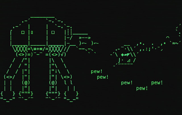
Docpop's exercise here isn't quite ASCII art, leaning on a couple of exotic Unicode characters to lend just the desired texture, but he's really aiming to evoke the minimalist technology aesthetic of a monochrome display. This scene, of course, depicts a duel between a Rebel Snowspeeder and an Imperial AT-AT Walker at the Battle of Hoth. I'm a big fan of the sound effects.
Die wanna wanga! Horsenburger drew this teletext portrait of Jabba the Hutt's concierge, Bib Fortuna. It's all a little pinker than I'd prefer, but we don't always get to choose our palettes.
When Axl was first dabbling into the textmode aesthetic, he did some wholesale machine conversions of iconic subjects. This Stormtrooper, included in the new MIST0520 artpack, is one such specimen.
Horsenburger's teletext Stormtrooper helmet, also from MIST0520, is a little more stylish, informed by a human's working around the limitations of the medium and actively harnessing them with lighting and use of negative space.
The Stormtroopers have a boss, and he... is apparently mounting a dogfight in space against the Coronavirus. The message is a little muddy, but the intent is clear here. Kalcha drew this Shift_JIS portrait of Darth Vader and a whole wing of TIE Fighters (plus his advanced model in the middle), also included in the MIST0520 artpack collection. Isn't that minimalist Death Star in the upper left corner something?
Here's a specimen of notepad ASCII art, likely intended to be viewed inverted -- black on white. (I'll leave the inverting as an exercise to the home viewer.) That, or it's a rendition of the Hello Kitty Vader cosplay. This was drawn by Aylien of Cro, part of their 2005 CRO-DSKMG0805-NOVIEW release.
Here Axl has pointed his convertatron at Vader, with predictable if effective results. This piece can also be found in the new MIST0520 artpack collection.
Again, Horsenburger livens things up a bit... the black teletext background already provides all of the fill that he needs, so he goes all fauvist with the outlines, achieving an effect I like to consider... Pride Vader.
Vader isn't the only Darth worth drawing in big textmode pixels, however. Here's an ANSI art illustration of Darth Maul drawn by ANSIchrist, included in the SENSE09 artpack released back in 2002, when Maul was still a wicked kind of going concern.
That brings us to their mutual big boss, Sheev "Darth Sidious" Palpatine, aka The Emperor. The teletext palette's limitations are in effect again here, but in this case I rather fancy they work in Horsenburger's favour.
We'll take a little break while enjoying James Lyle's minimalist ANSI art rendition of an iconic scene from Rogue One, a Star Destroyer looming overhead, preparing to erase Jedha City from the face of the planet.
We've seen the good, we've seen the bad... then there are the bounty hunters, amoral and indifferent to the endless destructive war between the Jedi and the Sith, as long as they can squeeze a few creds out of the conflict. Here's a Horsenburger teletext portrait of IG-88 from the new MIST0520 artpack.
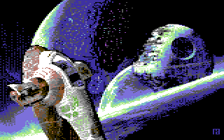
Not textmode at all, but still a lovely high resolution pixelart screen of Boba Fett's ship, Slave-1, from the recent 2XL Crew artpack.
And who flies Boba Fett's ship? Why, Boba Fett of course, Here's a teletext portrait by Nikki from MIST0520.
Here he is again, a fan favorite, drawn in uncoloured ANSI art by Aox for the 2013 Space Invaders Blocktronics artpack.
Acryl of Mean Scheme did a very nice job on this pixelart screen, found in the 9705 Mean Scheme artpack collection released 23 years ago! Not textmode art, but tossed in there as a fellow traveler.
But though Boba Fett wore Mandalorian battle armour, he did not come from Mandalore. This teletext screen shows another, similarly clad, with a better claim to the adjective. This Horsenburger teletext screen celebrating the Mandalorian was included in the MIST0520 artpack collection...
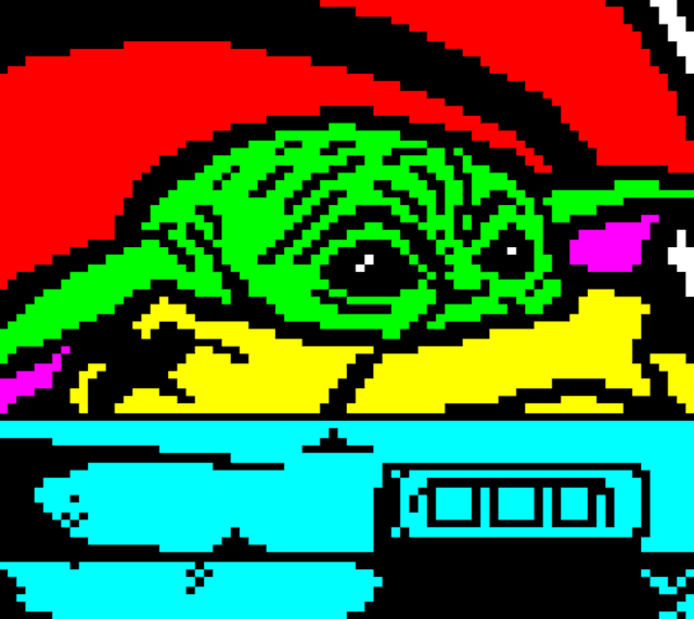
... as was this one, of his traveling companion "The Child", aka Baby Yoda, which provides us an excellent closing bookend for this post. See you next May, when I may finally be forced to get around to sharing Detention Block AA-23 with you! (Don't wait, it really is worthwhile!)